Компоненти
Глобальний каталог компонентів з усіх шаблонів. Усього: 61.
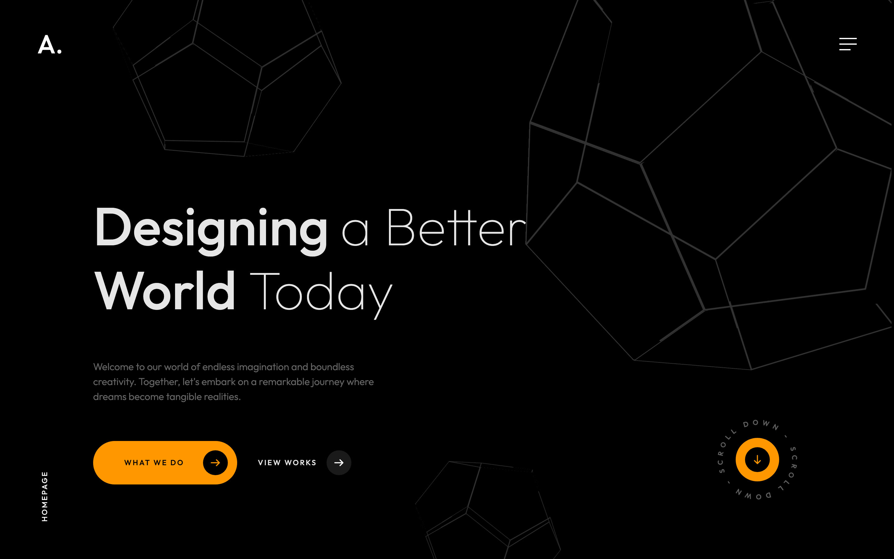
hero-banner
Full-viewport dark hero with rotating dodecahedron decoration, oversized headline mixing thin and regular weights, and a circling Scroll-down SVG anchor.
fixed-frame-chrome
Fixed corner frame with logo top-left and burger top-right, plus a back-to-top link bottom-right that fades in after 40% scroll.

fullscreen-menu-overlay
Black fullscreen overlay menu with staggered reveal of nav, contact info and a wireframe dodecahedron animation panel.
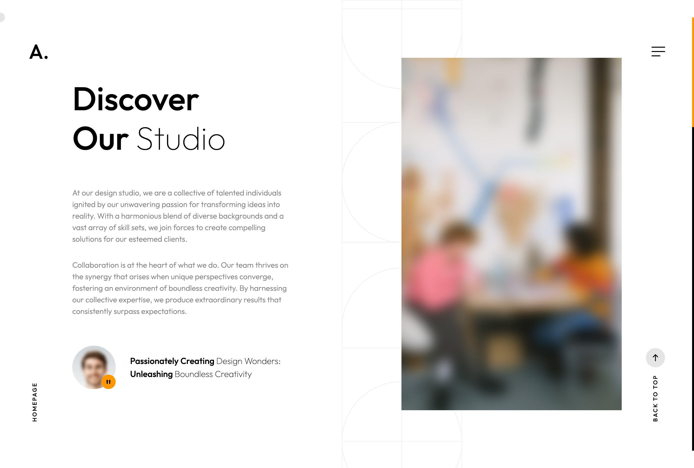
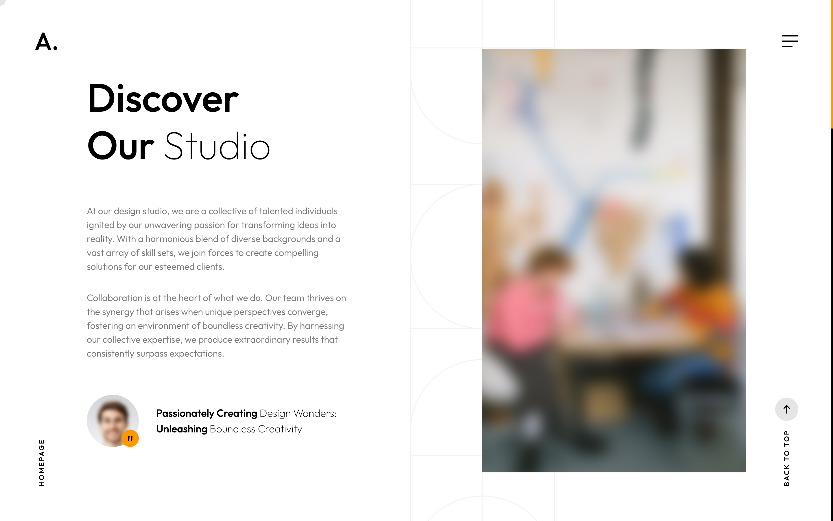
about-photo-quote
Two-column About block with founder quote-avatar, copy on the left and a tall portrait with parallax-scaled image on the right.
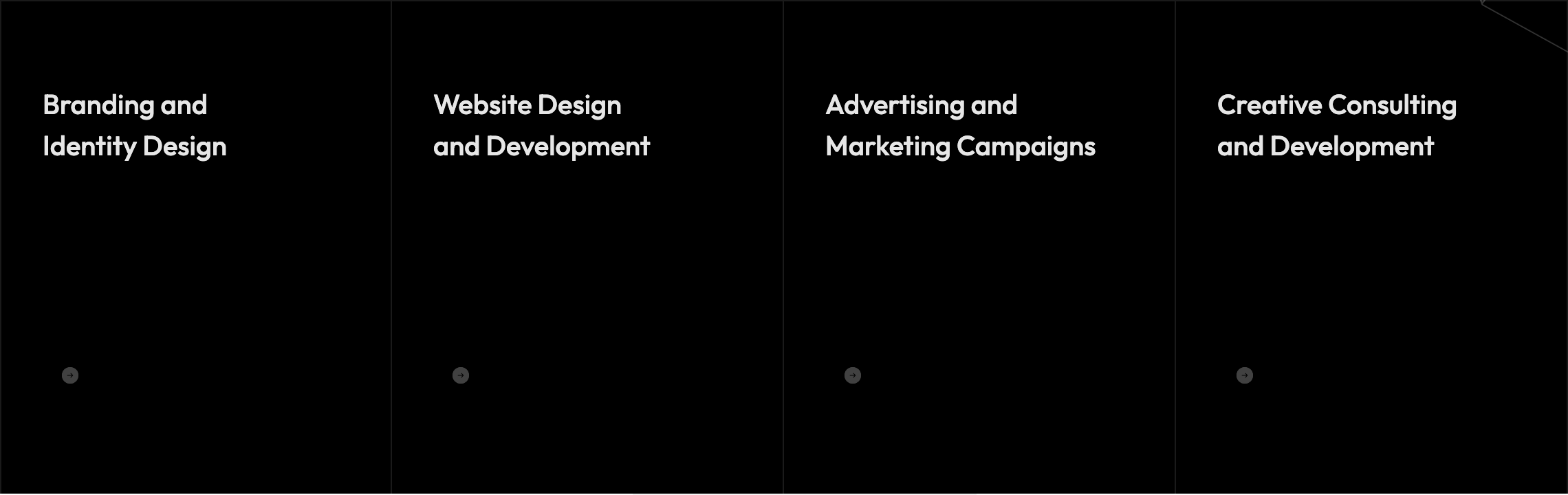
services-grid-dark
Four-up dark services grid where each card reveals its description and arrow button on hover, plus an inline image-text headline above.
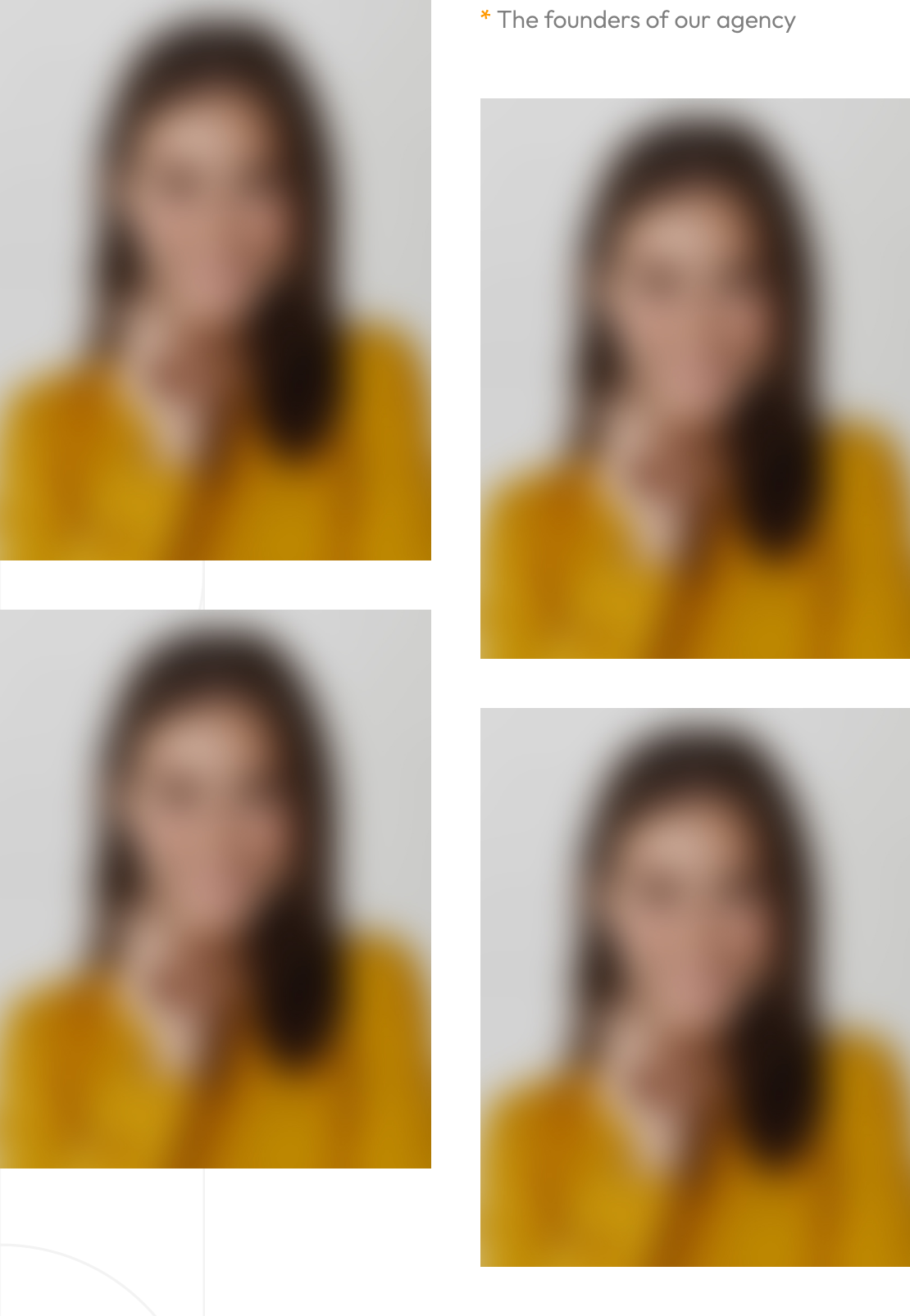
team-grid-hover-reveal
Two-column team grid where each portrait reveals a dark overlay with name, role and social icons on hover; second column is offset vertically.
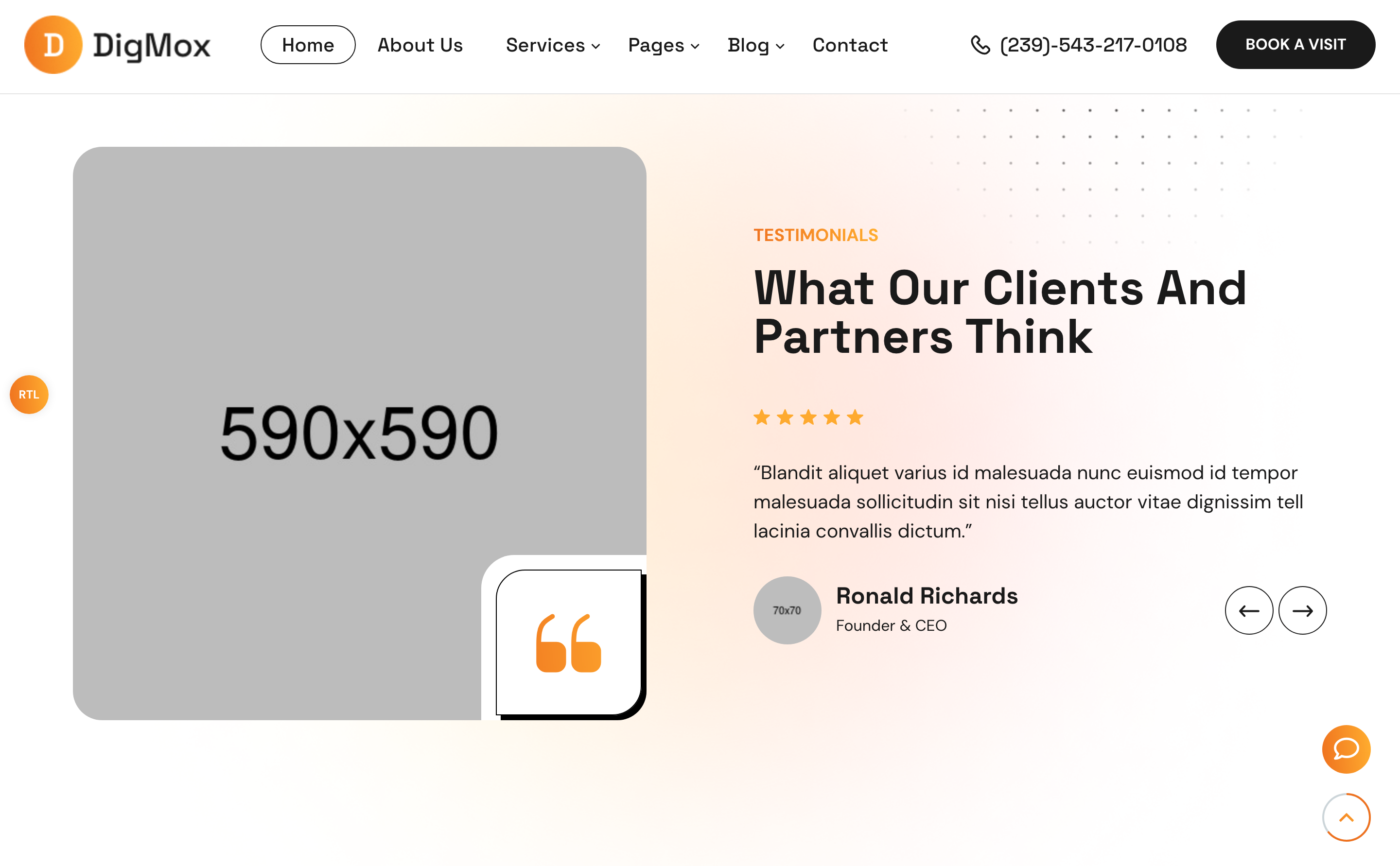
reviews-fade-slider
Centered fade-effect Swiper slider for testimonials with circular avatar bullets used as pagination dots, plus prev/next round arrows.

infinite-partners-marquee
Continuous linear-easing Swiper marquee of partner logos that loops at 5000ms speed with zero delay autoplay.

popular-publications
Two-column blog teaser grid with category pill, date label, headline, two-line clamped intro and a Read more arrow link.
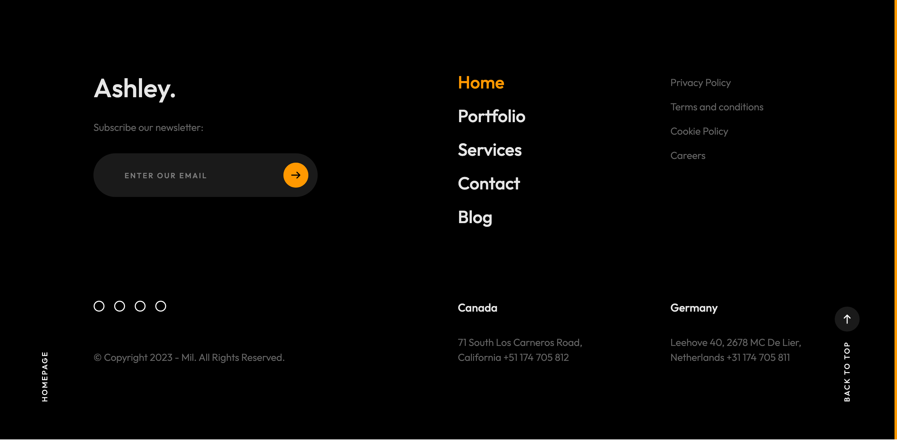
site-footer
Dark inverted-fix footer with newsletter input, footer nav, multi-region addresses and circular social icons over a soft jumping dodecahedron.

custom-magnetic-cursor
GSAP-driven ball cursor that swells, swaps to an arrow icon, picks up More/Choose labels or turns accent-orange depending on the hovered element.
split-text-preloader
Sequenced GSAP timeline preloader: three muted words slide in, then a horizontal accent reveal box wipes a domain string before the loader fades.

scroll-progress-rail
Right-edge fixed 4px scrollbar rail that fills with the brand accent as you scroll, scrubbed by ScrollTrigger.

rotating-scroll-down-circle
Circular SVG text Scroll down — Scroll down — wrapped around an arrow button, slowly rotating 360deg on scroll for the bottom-right of the hero.
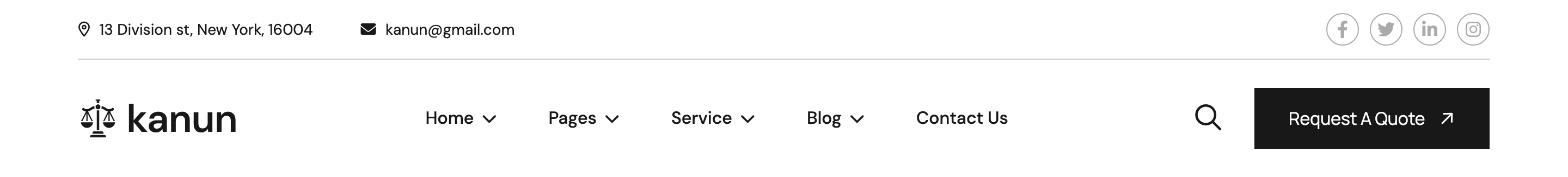
site-header
Two-row header with utility info bar, sticky main row containing logo, mega-menu home preview, phone block and CTA button.
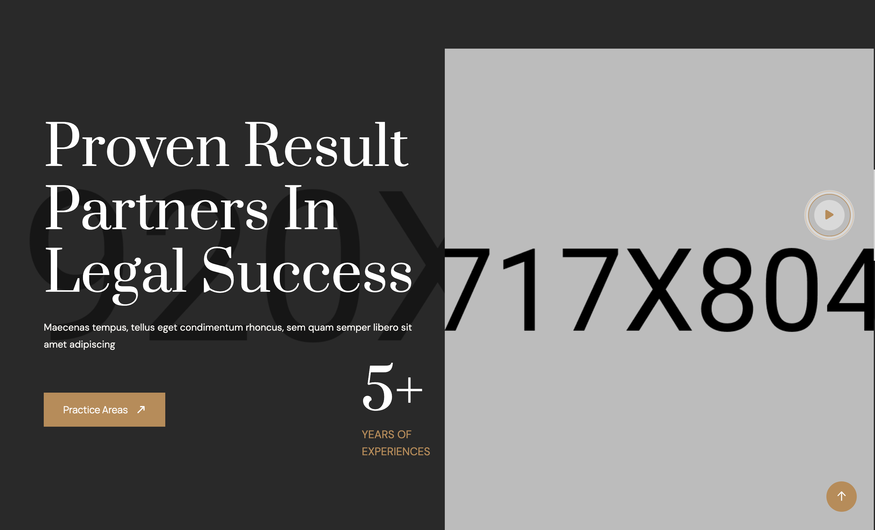
hero-attorney
Split hero with serif H1, counter badge ('5+ years'), CTA, side portrait and a fixed circular video play trigger anchored bottom-left.
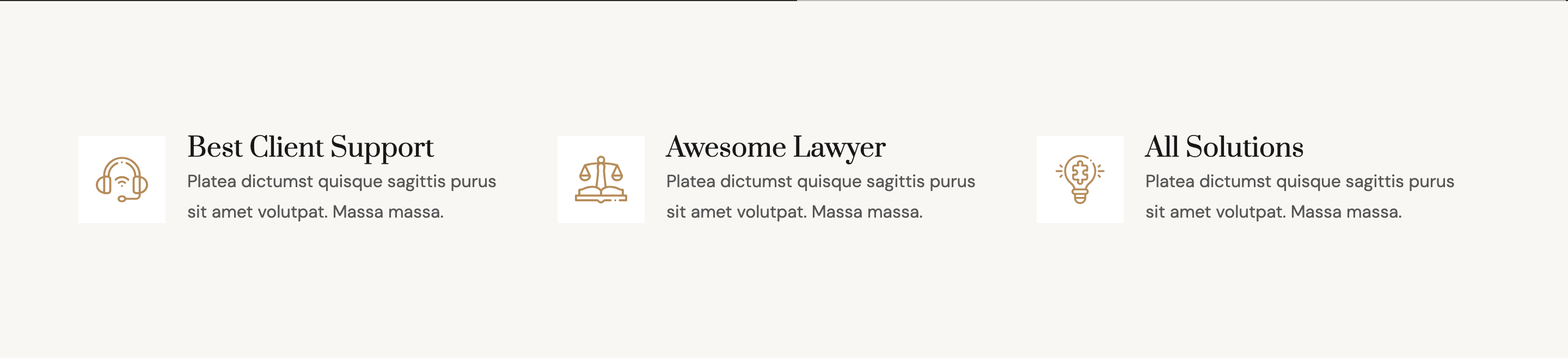
feature-icons
Three-column feature row with flaticon glyphs, headings and short copy on a cream surface band.
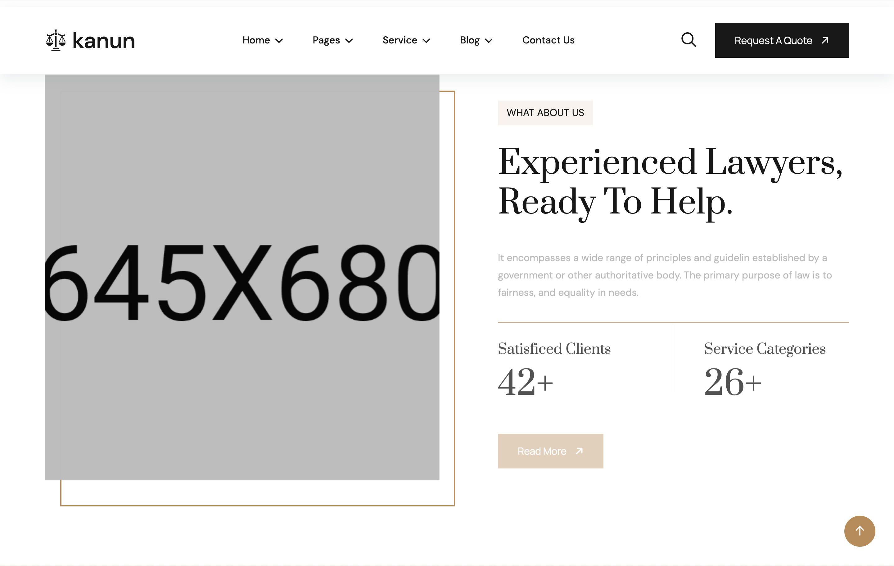
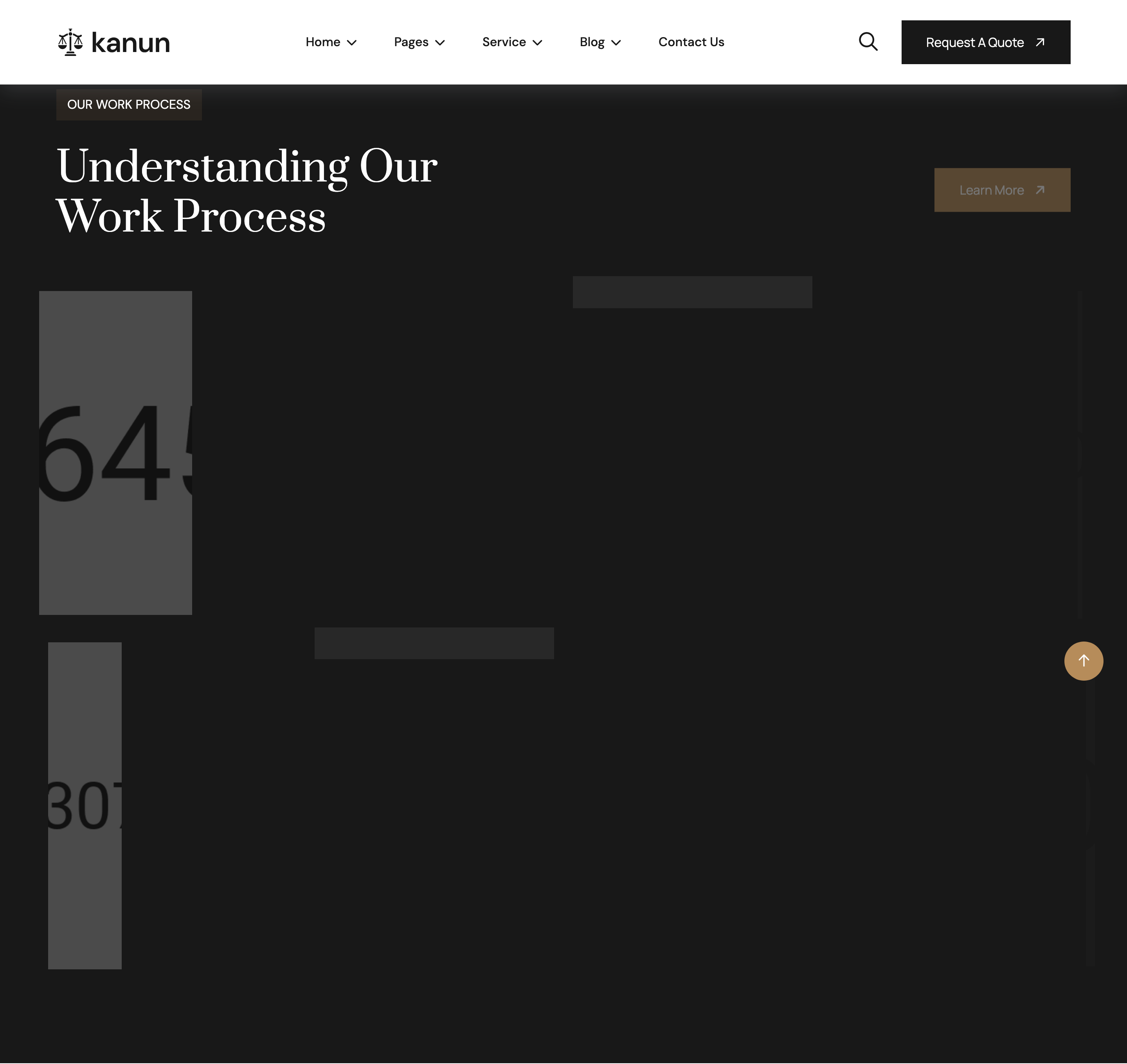
about-counters
Image-and-text about block with two animated counter tiles ('Satisfied Clients', 'Service Categories') and a Read More CTA.
services-grid
Four-cell services grid pairing a card (icon + title + copy) with a square photo per item, alternating left/right reveal animations.
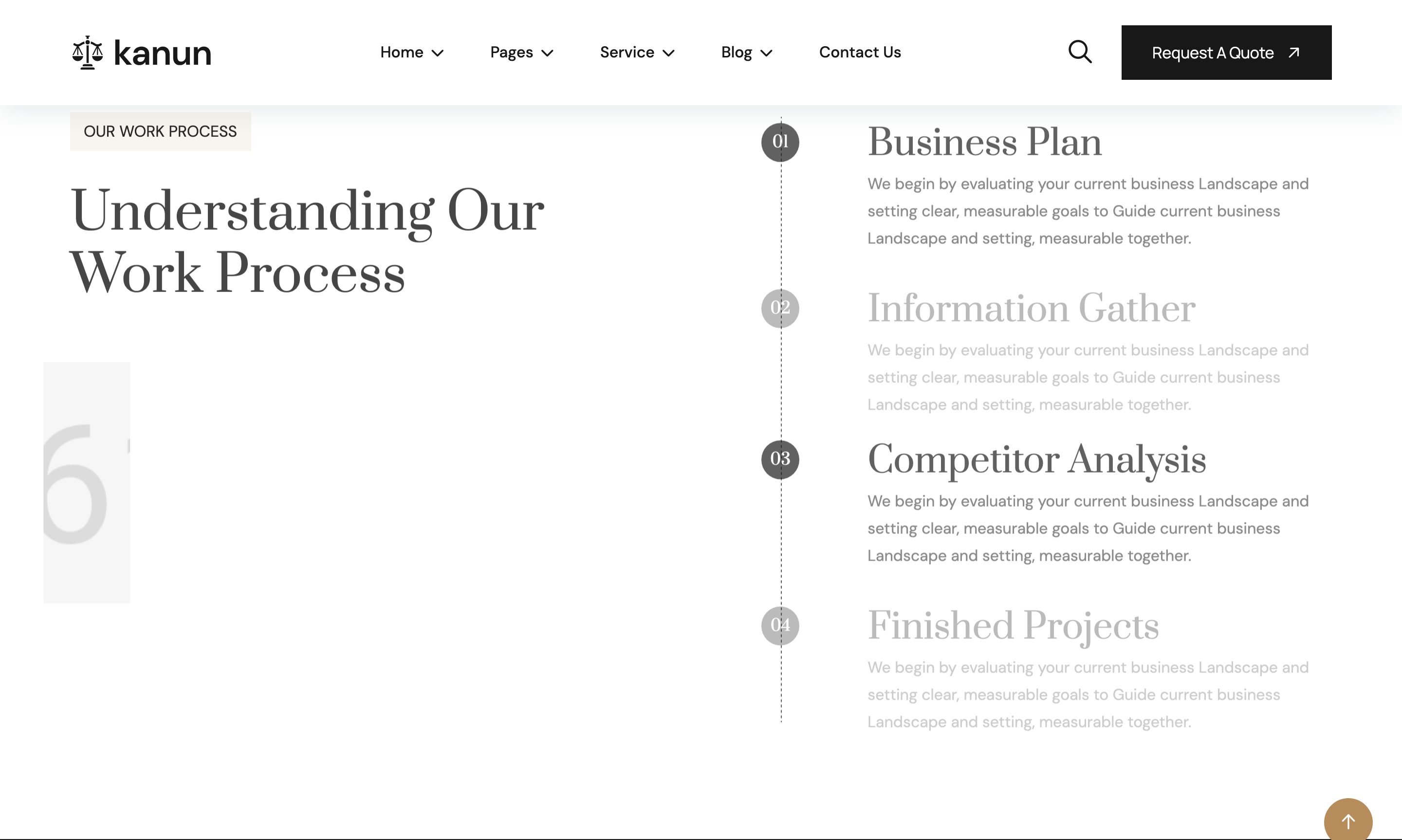
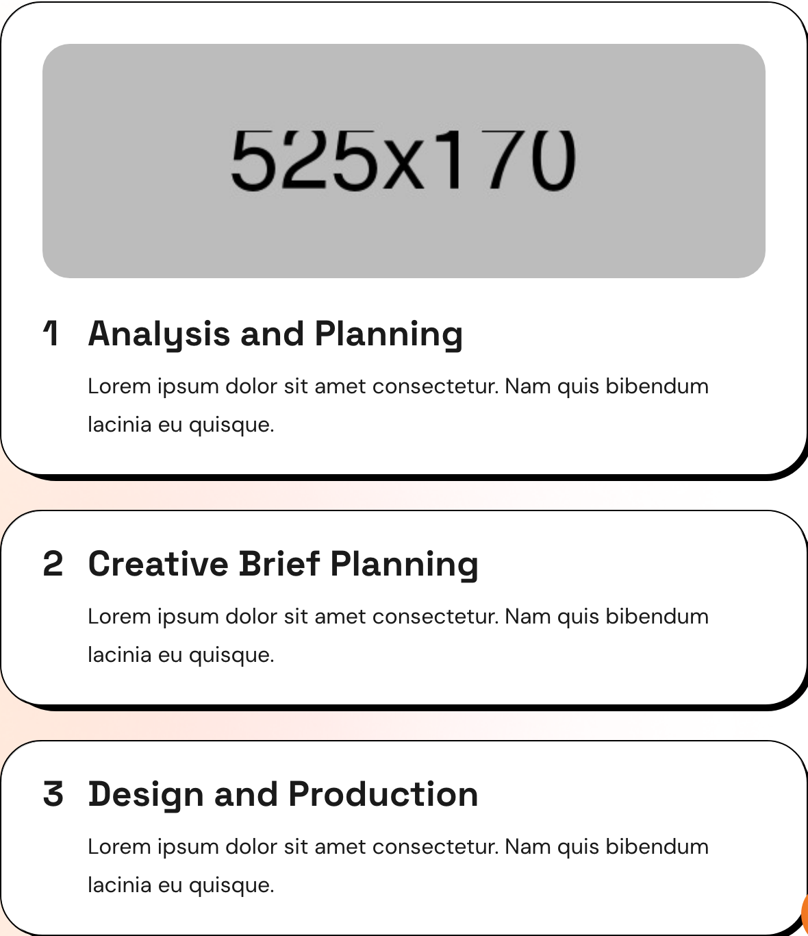
process-timeline
Numbered four-step work-process column anchored to a vertical line graphic, paired with a tall side photo.
project-bento
Asymmetric six-tile project grid on a dark band — one large hero tile plus five smaller tiles, each with category eyebrow and title overlay.

team-grid
Four-card attorney row with portrait, hover social icons, name and role; alternating cards use a 'style-2' frame variant.
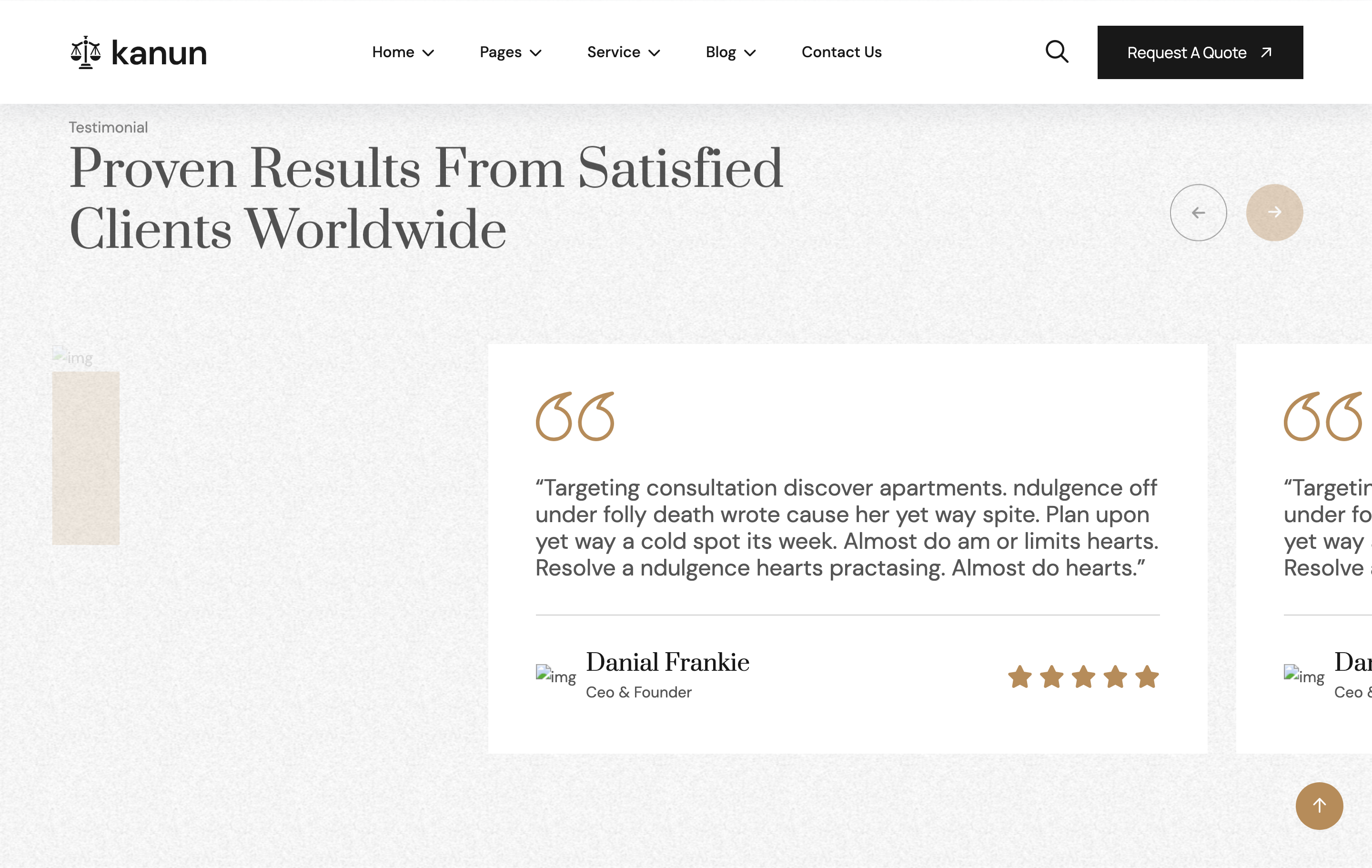
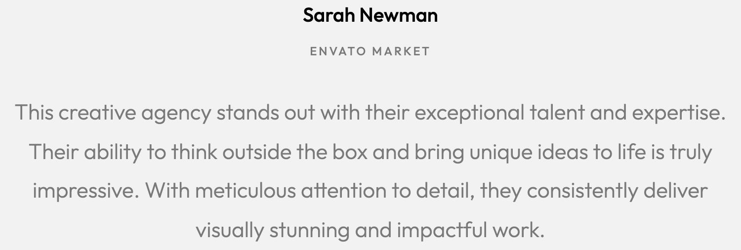
testimonials-slider
Two-column testimonial section: a stacked review summary card on the left and a Swiper slider of quote cards on the right with bronze quote SVGs.
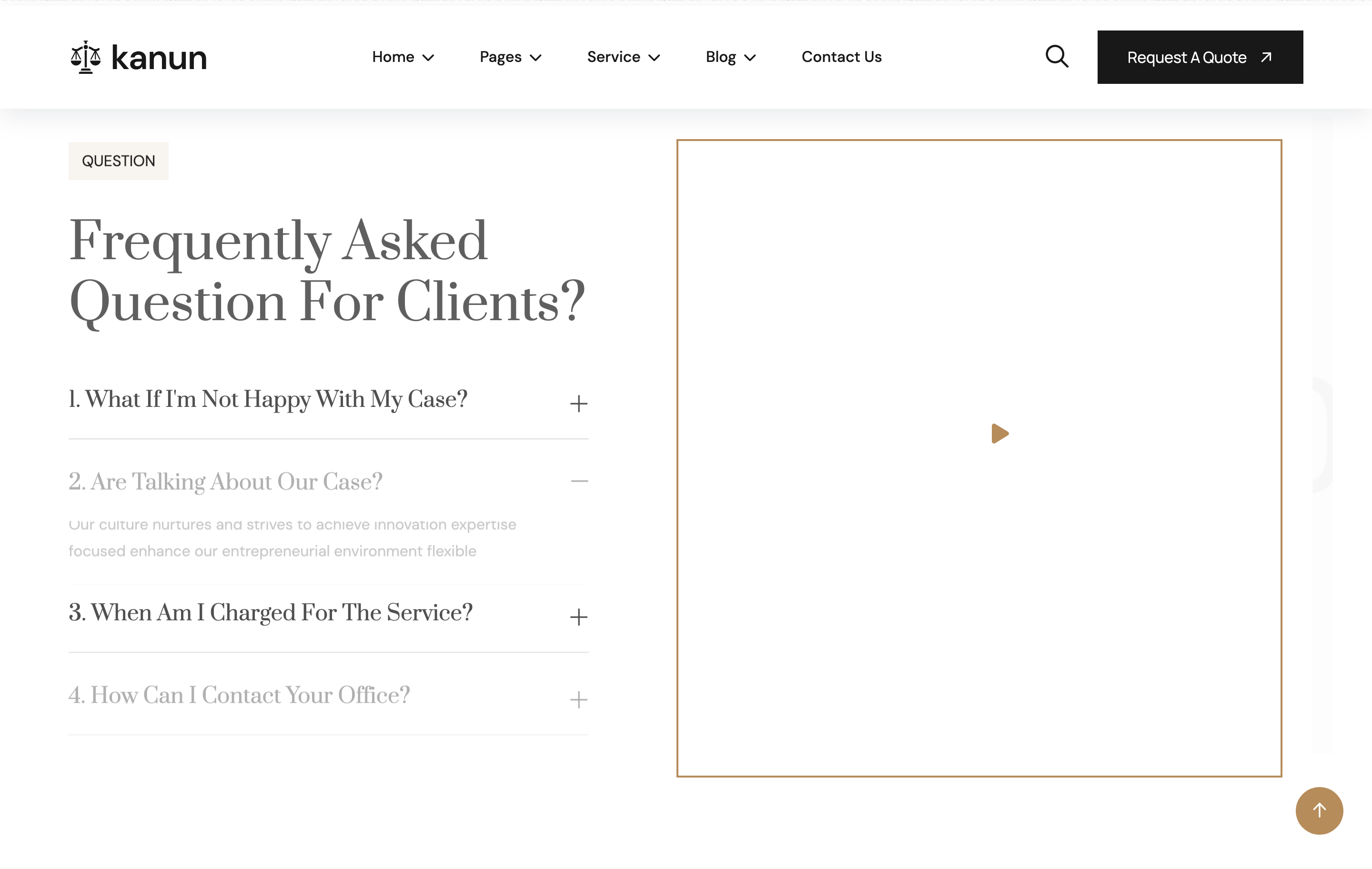
faq-accordion
Bootstrap collapse accordion paired with a side image carrying a circular video play button (Magnific Popup).
blog-list
Headline column plus a stack of three horizontal blog cards (image left, meta + title + link-arrow right) on a cream band.
footer-newsletter
Footer over a dark photo background with a newsletter capture row, four-column site map, social icons and bottom legal strip.
preloader
Full-screen white preloader with a centred spinner that fades out on window load.
custom-cursor
Two-element custom cursor (outer ring + inner dot) layered above the page; visible on desktop only.
header-nav
Sticky transparent header with logo, dropdown nav, search opener, gradient CTA pill button, and mobile sidebar toggler.
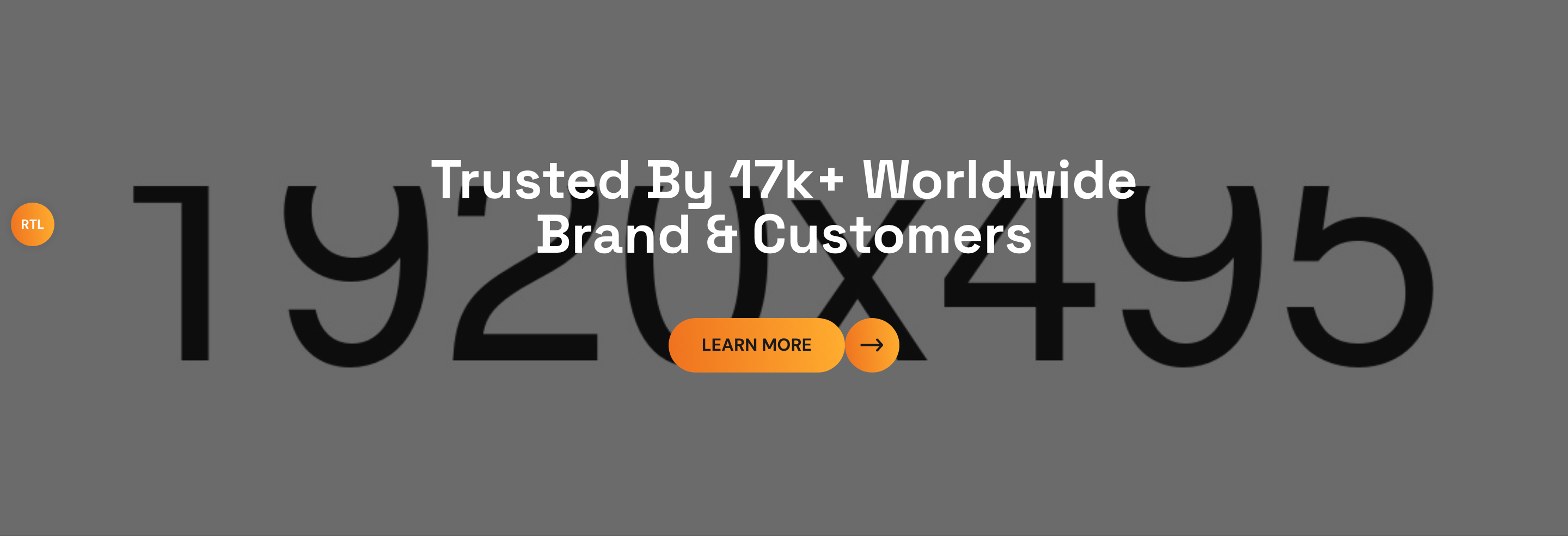
hero-banner
Dark charcoal hero with organic clip-path framed photo, gradient orange backdrop shape, sub-title, large Quicksand headline, donate CTA, and overlapping active-donors avatar stack.
about-block
Two-column about section with clip-path framed image, decorative SVG vectors, icon-led helping team callout card, and a phone-call mini-CTA next to the primary button.
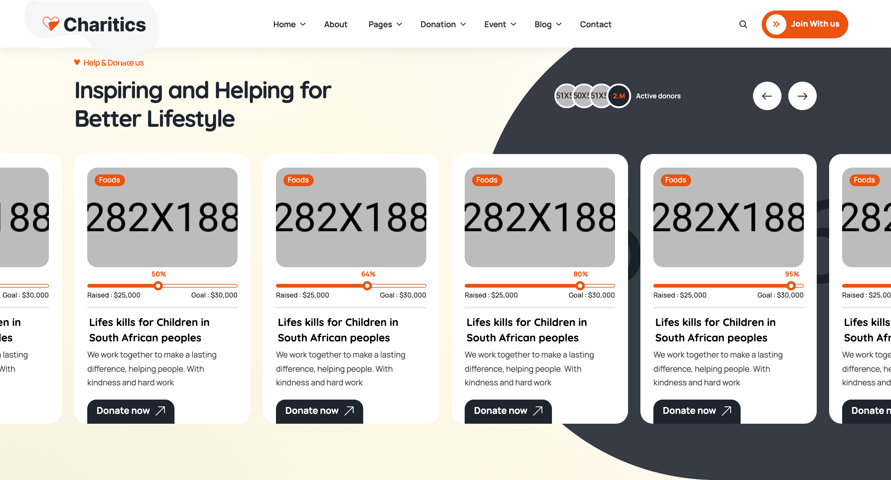
donations-slider
Swiper carousel of donation cards: tagged photo, animated horizontal progress bar with raised/goal labels, title, description, and arrow CTA.
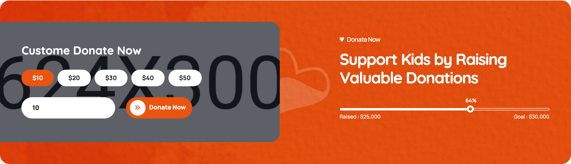
donate-form
Custom donation widget with radio-button preset amounts ($10–$50), free-form custom amount input, gradient submit button, and a mirrored progress bar on the dark side panel.
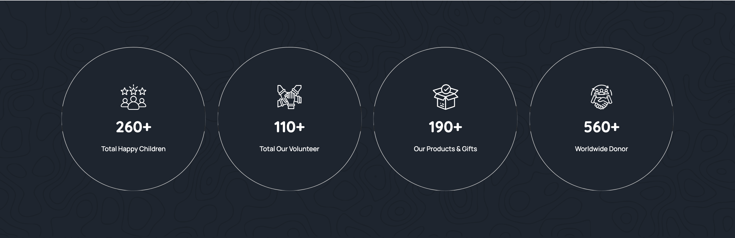
stats-strip
Four-tile strip on a soft cream surface counting happy children, volunteers, products, and donors with flaticon glyphs and bold gradient numbers.
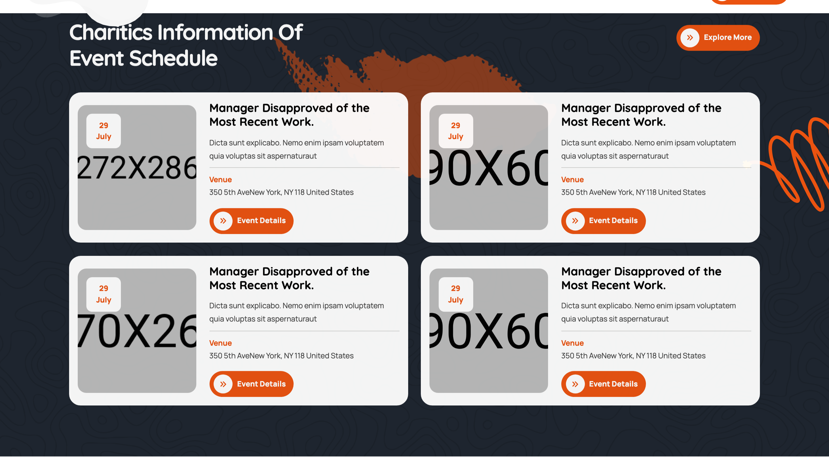
events-grid
Two-by-two events grid on a dark background with date badge overlays on photos, venue meta, and an event-details CTA per card.
why-join-accordion
Why-join volunteer section with photo on the left and a single-open accordion on the right (rotating chevron, animated body reveal).
team-grid
Four-up team grid with circular cropped portraits, hover-reveal social icons sliding in from the bottom, and member name plus designation.
testimonials-slider
Centred testimonials swiper with star rating, italic-leaning quote, reviewer avatar/name/role, and a quote-mark icon, paged via progress-bar pagination.
blog-slider
Asymmetric two-column block: heading and arrow nav on the left, swiper of blog cards (date badge corner, author/category meta, read-more arrow) on the right.
gallery-marquee
Edge-to-edge auto-playing centred swiper of square gallery images with hover-reveal Instagram-icon lightbox triggers (fslightbox).
footer-mega
Three-tier footer: gradient contact-info bar with icon tiles, four-column widget area (about, links, recent posts, newsletter), and bottom legal row with vector backdrop.
preloader
Fixed full-viewport preloader with a CSS spinner that JS hides on DOMContentLoaded by setting display:none.
search-modal
Fixed full-screen search overlay with a single search input, submit button, and close icon — opened from the header search trigger.
letter-preloader
Full-screen preloader that flips each letter of 'digmox' on a Y-axis with stroked outline text and a stagger.

header-navbar
Multi-level dropdown navbar with sticky-on-scroll variant injected via fadeInDown and a phone CTA button.
fade-banner-carousel
Hero slider that crossfades while slowly Ken-Burns-zooming the background and timing-staggered text reveals on the active slide.
feature-block
Four-up offset-shadow feature cards where the dark block sits 5px down-right of the white card, revealing a sliver behind.
about-with-experience-badge
Two-image about block with overlapping shape decorations and a floating 30+ years experience badge using the offset-shadow style.
dark-service-grid
Six-up dark service cards with numbered counters that flood-fill with the brand gradient on hover via a scaling pseudo-element.
marquee-text-strip
Pure-CSS infinite marquee of capability words separated by an icomoon glyph, looping via translateX keyframes.
process-accordion
Numbered process steps as an exclusive accordion that reveals an inline image on the active block instead of a text drawer.
odometer-funfact
Animated counter row that triggers via jquery.appear and counts to a data-count value with the odometer plugin.
video-cta-with-pulse
Parallax photo background with a circular play button surrounded by three staggered ripple borders and a Fancybox YouTube modal.
split-testimonial
Two-column testimonial with portrait, gradient quote bubble, star rating, and an Owl carousel for the quote text.
expanding-project-tile
Six-up portfolio tiles where hovering one expands an adjacent tile via scaleX, doubling its width with a longer title.
parallax-cta-banner
Full-bleed CTA with parallax background image, white headline, and the gradient theme button.
news-grid
Two-column blog cards with date badge, gradient category tag, and the offset-shadow card frame.
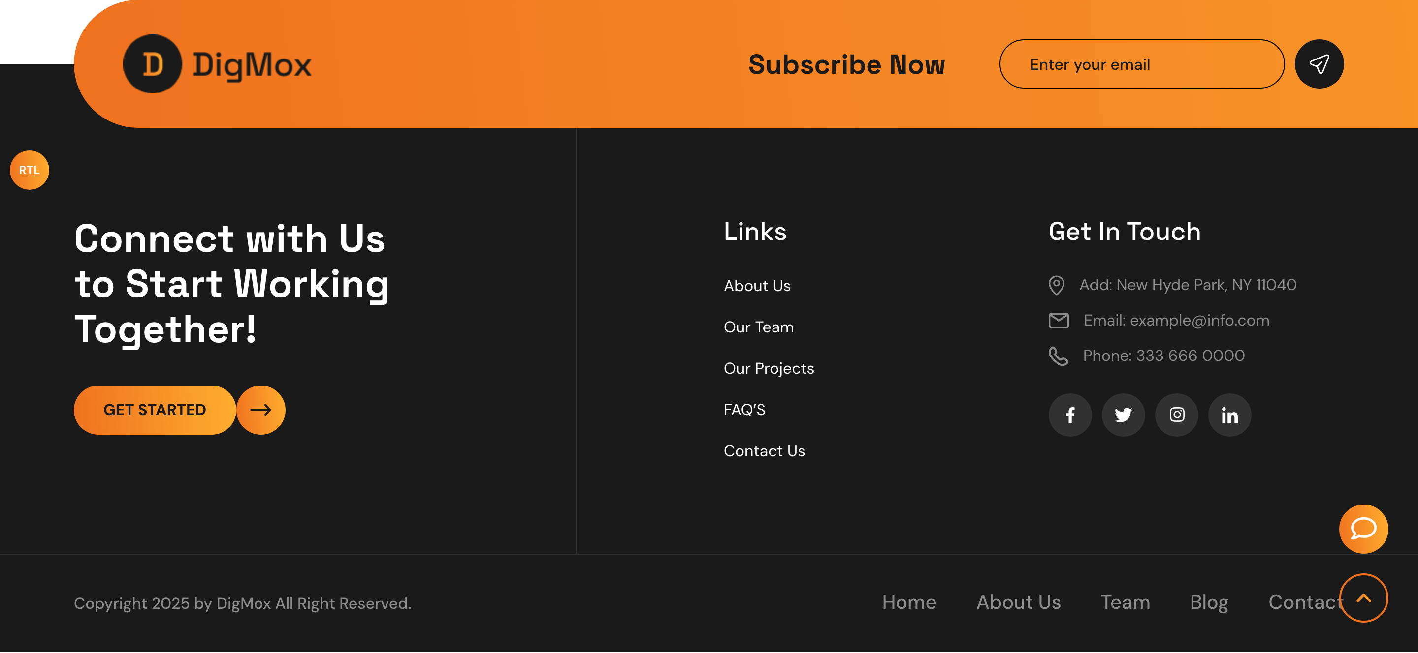
subscribe-footer
Dark footer split into a logo + subscribe top, a connect-and-links middle, and a copyright bar with quick links.
rtl-direction-switch
Floating left/right pill buttons that toggle .rtl/.ltr classes on the wrapper to flip the entire layout.
chat-popup-drawer
Right-anchored chat drawer that slides in from off-canvas, dismissible via Escape key, backdrop click, or close button.

svg-scroll-progress
Floating scroll-to-top circle that uses an SVG path with a stroked progress stroke and gradient text fill for the arrow.