project-bento
Галерея·Шаблон: Kanun - Attorney & Law Agency HTML Template·Складність анімації: subtle·Адаптивний: Так
Файли-джерела
- index.html
section.project-section
Бібліотеки
bootstrapaos
Summary
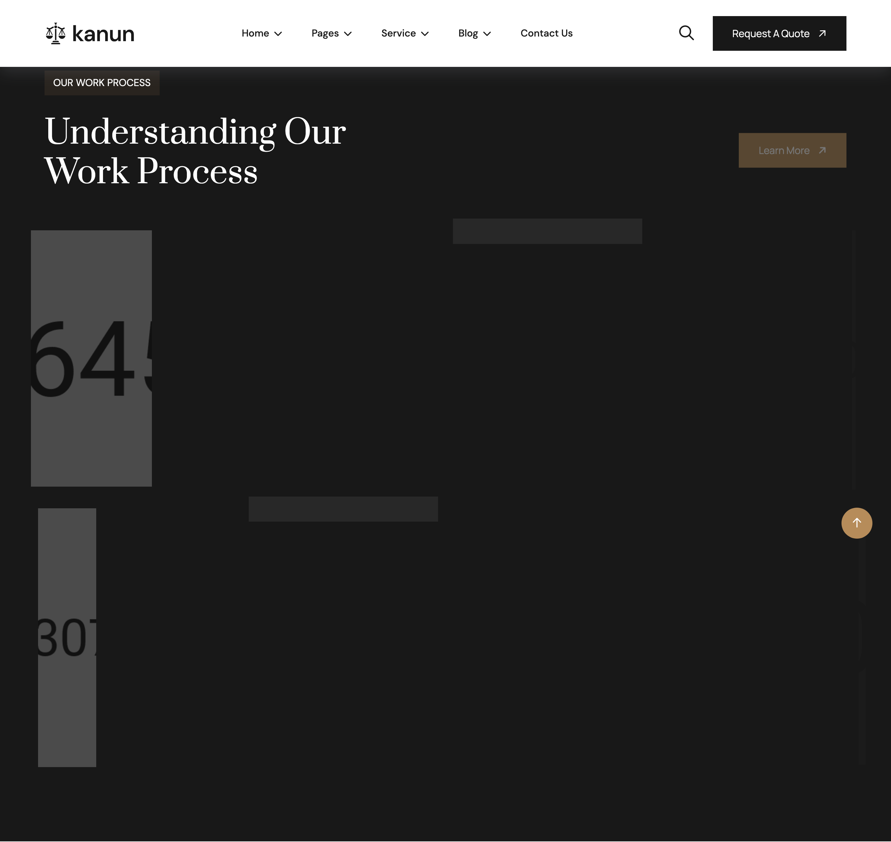
Asymmetric six-tile project grid on a dark band: one large 6-col tile, three 3-col tiles, then mirror with a 6-col tile. Each tile carries an image with an overlay containing a category eyebrow ("Real Estate") and a project title link. Reveal directions alternate (left / top / right) for visual rhythm.
HTML structure (minimal)
<section class="project-section section-padding fix section-bg2">
  <div class="container">
    <div class="section-title-area">
      <div class="section-title">
        <span class="sub-title text-white">OUR WORK PROCESS</span>
        <h2 class="text-white">Understanding Our <br> Work Process</h2>
      </div>
      <a href="portfolio-details.html" class="theme-btn">Learn More</a>
    </div>
    <div class="row">
      <div class="col-xl-6 col-lg-6">
        <div class="project-card-items img-custom-anim-left wow">
          <div class="project-image">
            <img src="assets/img/project/01.jpg" alt="">
            <div class="project-content">
              <span>Real Estate</span>
              <h3><a href="portfolio-details.html">Community Involvement</a></h3>
            </div>
          </div>
        </div>
      </div>
      <!-- 4× col-xl-3 tiles, then 1× col-xl-6 -->
    </div>
  </div>
</section>
Key SCSS tokens
.project-section.section-bg2 {
  background: var(--header); /* near-black */
  padding-block: 120px;
}
.section-title-area {
  display: flex;
  justify-content: space-between;
  align-items: end;
  margin-bottom: 64px;
}
.project-card-items {
  position: relative;
  overflow: hidden;
  border-radius: 6px;
  margin-bottom: 24px;
  .project-image img {
    width: 100%; height: 100%; object-fit: cover;
    transition: transform 0.6s;
  }
  &:hover img { transform: scale(1.06); }
  .project-content {
    position: absolute;
    inset: auto 24px 24px 24px;
    background: var(--white);
    padding: 16px 24px;
    span { color: var(--theme); font-size: 12px; letter-spacing: 0.18em; }
    h3 a { font-family: "Prata"; font-size: 20px; color: var(--header); }
  }
}
Animation logic
// Each tile has its own .img-custom-anim-{left|top|right} class —
// WOW.js stages them sequentially based on document order, so the
// reveal sweeps in a wave across the row.
new WOW().init();
Notable details
- Mixing
col-xl-6andcol-xl-3produces a magazine layout (1+3+ tail-1 across two rows) without any custom CSS grid — pure Bootstrap. - Overlay card sits at the bottom-left corner, NOT centered, so titles stay legible against varied photo content.
- The
section-bg2modifier flips the entire section to dark, with white text and a bronze eyebrow — a frequent pattern across the template.
Use when
- Portfolio reels for case studies / projects where you want one or two pieces emphasised per band.
- Real-estate or studio sites needing a magazine-style gallery without a bento grid library.
Caveats
- The bottom-left overlay can clip on very portrait images; test with assets at the actual aspect ratios before shipping.