about-with-experience-badge
Файли-джерела
- index.html
section.about-section .image_block_one
Бібліотеки
jquery
Summary
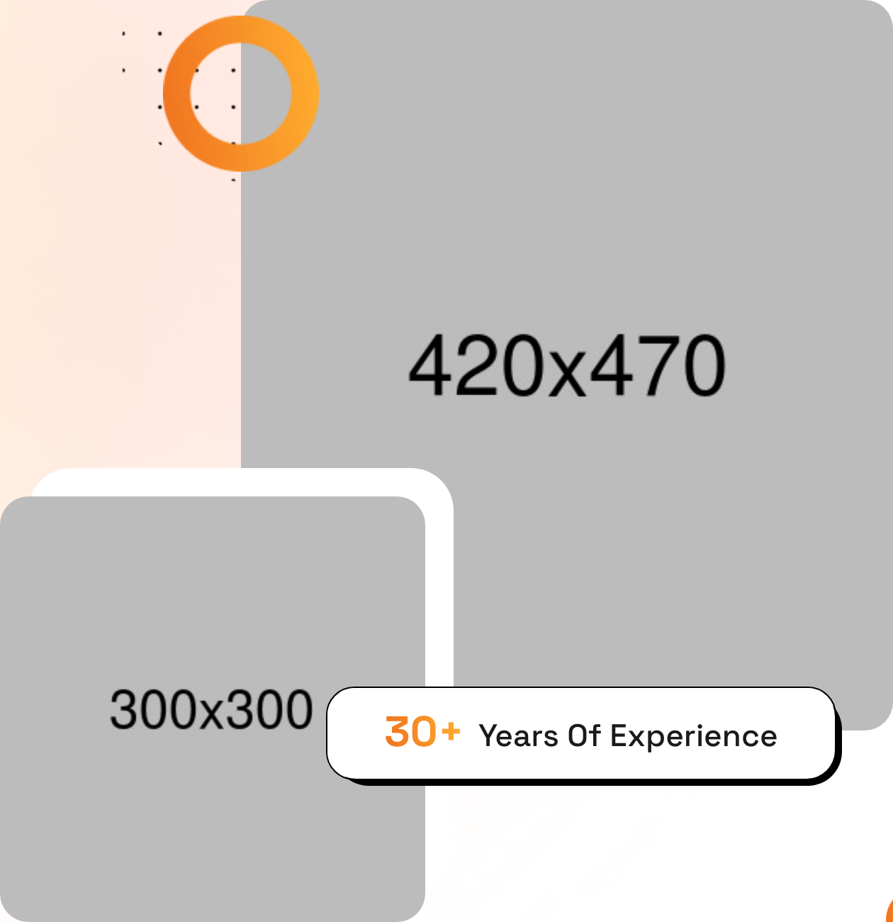
Two-column About section with a content-on-left, two-image-collage-on-right layout. The right column overlaps two photos, surrounds them with looping-animation decorative shapes, and floats a "30+ Years Of Experience" badge using the offset-shadow card style.
HTML structure (minimal)
<section class="about-section">
  <div class="pattern-layer" style="background-image: url(shape-4.png);"></div>
  <div class="auto-container">
    <div class="row">
      <div class="col-lg-6 content-column">
        <div class="content-box">
          <div class="sec-title">
            <span class="sub-title gradient-color">About US</span>
            <h2>Reveal Your Brand Strategy Adventures</h2>
          </div>
          <p>Lorem ipsum dolor sit amet consectetur…</p>
          <div class="inner-box block-shadow">
            <h3>DigMox Identity</h3>
            <ul class="list-style-one">
              <li>Brand Strategy</li>
              <li>Identity Build</li>
            </ul>
          </div>
          <a href="about.html" class="theme-btn btn-one"><span class="text">Learn More</span></a>
        </div>
      </div>
      <div class="col-lg-6 image-column">
        <div class="image_block_one">
          <div class="image-box">
            <div class="image-shape">
              <div class="shape-1 zoom-fade" style="background-image: url(shape-2.png);"></div>
              <div class="shape-2"        style="background-image: url(shape-3.png);"></div>
            </div>
            <figure class="image image-1"><img src="about-1.jpg" alt=""></figure>
            <figure class="image image-2"><img src="about-2.jpg" alt=""></figure>
            <div class="experience-box block-shadow">
              <h3><span class="gradient-color">30+</span>Years Of Experience</h3>
            </div>
          </div>
        </div>
      </div>
    </div>
  </div>
</section>
Key SCSS tokens
.zoom-fade { animation: zoom-fade 5s infinite linear; }

.block-shadow {
  position: relative; background: #fff; border: 1px solid #000; z-index: 1;
}
.block-shadow::before {
  content: ''; position: absolute;
  background: #000;
  width: calc(100% + 5px); height: calc(100% + 5px);
  border-radius: 30px 40px 34px 40px;
  z-index: -1;
}

.experience-box h3 .gradient-color {
  background: var(--theme-color);
  -webkit-background-clip: text;
  -webkit-text-fill-color: transparent;
}
Animation logic
@keyframes zoom-fade {
  0%   { transform: scale(1);   opacity: 1; }
  50%  { transform: scale(1.1); opacity: 0.5; }
  100% { transform: scale(1);   opacity: 1; }
}
Notable details
- Two photos are absolutely positioned and slightly overlap — a classic "collage" pattern that reads more bespoke than a single hero photo.
- Decorative
shape-1runs thezoom-fadekeyframe to feel alive without a JS dependency. - The experience badge re-uses
.block-shadow— same component primitive as feature cards, kept consistent across the page.
Use when
- About-us sections where two photos help tell a story of people + workspace.
- Where you want a metric (years, projects, clients) to hover authoritatively over the photo.
Caveats
- The image-shape decorations rely on absolute positioning numbers tuned to the demo photo aspect ratios; replacement images may need pixel adjustments.
- The 30+ uses the same gradient as eyebrow text — looks great with one accent gradient, less great if you swap to a single solid colour.