blog-list
Картка блогу·Шаблон: Kanun - Attorney & Law Agency HTML Template·Складність анімації: subtle·Адаптивний: Так
Файли-джерела
- index.html
section.news-section
Бібліотеки
bootstrapaos
Summary
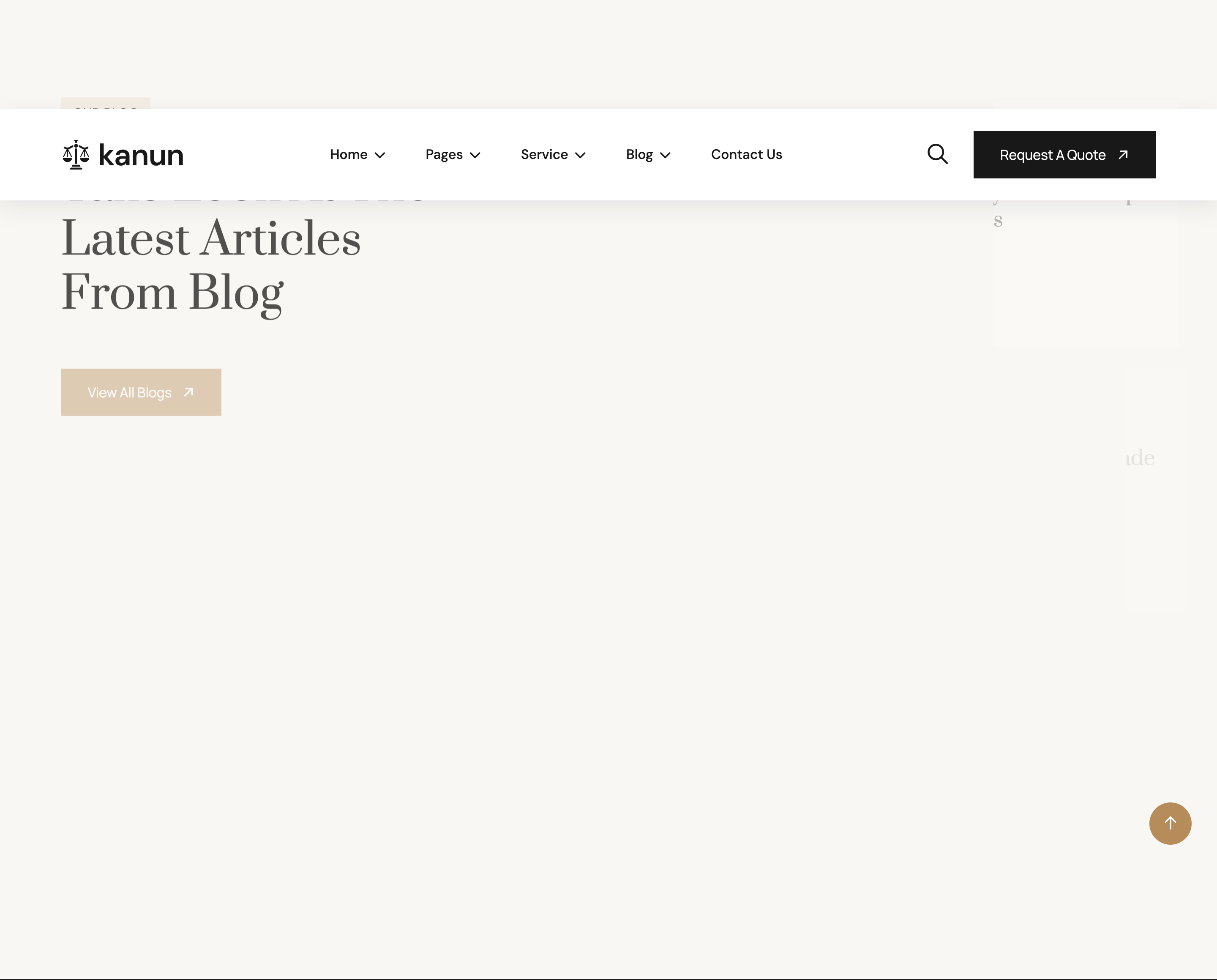
Asymmetric blog band on a cream surface. Left column (col-lg-5) holds the headline, eyebrow and a "View All Blogs" CTA. Right column (col-lg-7) stacks three horizontal blog cards: image left, post-meta dot list above title, and an arrow link below. Each card slides in from the right via img-custom-anim-right with cascading delays.
HTML structure (minimal)
<section class="news-section section-padding section-bg fix">
  <div class="container">
    <div class="row g-4">
      <div class="col-lg-5">
        <div class="section-title mb-0">
          <span class="sub-title">our blog</span>
          <h2>Take Look at The <br>Latest Articles <br>from blog</h2>
        </div>
        <a href="news-details.html" class="theme-btn mt-5">View All Blogs</a>
      </div>
      <div class="col-lg-7">
        <div class="news-card-items mb-4 img-custom-anim-right wow" data-wow-delay=".2s">
          <div class="news-image"><img src="assets/img/news/01.jpg"></div>
          <div class="news-content">
            <ul class="post-meta">
              <li>March 26, 2025</li>
              <li>International</li>
            </ul>
            <h4><a href="news-details.html">Common Law Systems Concept <br>Decisions Courts</a></h4>
            <a href="about.html" class="link-btns">View Details <i class="fa-solid fa-arrow-right"></i></a>
          </div>
        </div>
        <!-- 2 more cards -->
      </div>
    </div>
  </div>
</section>
Key SCSS tokens
.news-section.section-bg {
  background: var(--bg); /* cream */
  padding-block: 120px;
}
.news-card-items {
  display: flex;
  gap: 24px;
  background: var(--white);
  padding: 16px;
  border-radius: 8px;
  align-items: stretch;

  .news-image {
    flex: 0 0 220px;
    img { width: 100%; height: 100%; object-fit: cover; border-radius: 6px; }
  }
  .news-content {
    flex: 1;
    padding: 16px 8px 16px 0;
    .post-meta {
      display: flex; gap: 24px;
      list-style: none; padding: 0; margin: 0 0 8px;
      li {
        font-size: 13px;
        color: var(--text);
        position: relative;
        &:not(:last-child)::after {
          content: ""; position: absolute;
          right: -12px; top: 50%; transform: translateY(-50%);
          width: 4px; height: 4px;
          border-radius: 50%; background: var(--theme);
        }
      }
    }
    h4 a { font-family: "Prata"; font-size: 22px; color: var(--header); }
    .link-btns { color: var(--theme); margin-top: 12px; display: inline-block; }
  }
}
Animation logic
// WOW.js triggers .img-custom-anim-right which clip-paths each card from
// right to left as it scrolls in; staggered delays produce a cascade.
new WOW().init();
Notable details
- The headline column is shorter than the right cards combined, leaving deliberate vertical breathing room — the CTA sits in that whitespace.
.post-metauses inter-list bullet dots invar(--theme)accent colour as separators, drawn with::after.- Cards are horizontal (image-left, content-right) rather than the more common vertical magazine card — emphasises article density on a single screen.
Use when
- Blog teasers where you want 3 articles + headline in one section without scrolling.
- Sites where horizontal cards feel more "press release" than vertical cards do.
Caveats
.news-imageflex-basis is fixed at 220px; very small viewports compress it — switch to a stacked column at thelgbreakpoint or under.- Hand-coded
<br>line breaks inside<h4><a>titles will mis-wrap on translation — strip them for dynamic content.