site-header
Навігація·Шаблон: Kanun - Attorney & Law Agency HTML Template·Складність анімації: subtle·Адаптивний: Так
Файли-джерела
- index.html
header.header-section-1
Бібліотеки
bootstrapjquery
Summary
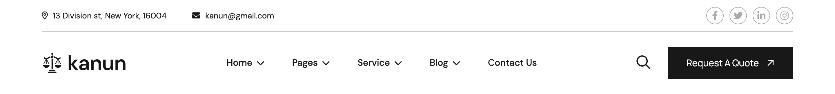
Two-row header: a slim dark utility bar (address, email, social) and a sticky main row containing the logo, a phone-with-icon block, the primary nav (with a Home mega-menu of demo previews), a search trigger and a Request-A-Quote CTA. Three style variants exist across index.html, index-2.html, index-3.html.
HTML structure (minimal)
<header class="header-section-1">
  <div class="header-top-section">
    <div class="container">
      <div class="header-top-wrapper">
        <ul class="top-left">
          <li><i class="fa-sharp fa-regular fa-location-dot"></i> 13 Division st, New York</li>
          <li><i class="fa-solid fa-envelope"></i> <a href="mailto:kanun@gmail.com">kanun@gmail.com</a></li>
        </ul>
        <div class="top-right">
          <div class="social-icon">
            <a href="#"><i class="fab fa-facebook-f"></i></a>
            <a href="#"><i class="fab fa-twitter"></i></a>
          </div>
        </div>
      </div>
    </div>
  </div>
  <div id="header-sticky" class="header-1">
    <div class="main-logo"><a href="index.html"><img src="..." alt="logo"></a></div>
    <div class="countact-call">
      <div class="icon"><i class="fa-solid fa-phone"></i></div>
      <div class="content"><span>Call Any Time</span><h6><a href="tel:...">+869 878 08 68</a></h6></div>
    </div>
    <div class="container">
      <div class="mega-menu-wrapper">
        <div class="header-main">
          <nav id="mobile-menu">
            <ul>
              <li class="has-dropdown menu-thumb"><a href="index.html">Home <i class="fa-solid fa-chevron-down"></i></a>
                <ul class="submenu has-homemenu"><li>...</li></ul>
              </li>
              <!-- Pages, Service, Blog, Contact -->
            </ul>
          </nav>
          <div class="header-right">
            <a href="#0" class="search-trigger"><i class="fa-regular fa-magnifying-glass"></i></a>
            <a href="contact.html" class="theme-btn style-2">Request A Quote</a>
          </div>
        </div>
      </div>
    </div>
  </div>
</header>
Key SCSS tokens
.header-1 {
  position: relative;
  z-index: 99;
  padding: 0 60px;
  display: flex;
  align-items: center;
  justify-content: space-between;
  &.sticky {
    position: fixed;
    top: 0; left: 0; right: 0;
    background: var(--white);
    box-shadow: var(--box-shadow);
    animation: slideInDown 0.6s both;
  }
}
.header-top-section {
  background: var(--header);
  color: var(--white);
  padding: 12px 0;
  font-size: 14px;
}
Animation logic
// Sticky on scroll past 250px
$(window).scroll(function () {
  if ($(this).scrollTop() > 250) $("#header-sticky").addClass("sticky");
  else $("#header-sticky").removeClass("sticky");
});

// Search popup toggle
$(".search-trigger").on("click", function (e) {
  e.preventDefault();
  $(".search-wrap").animate({ opacity: "toggle" }, 500);
});
Notable details
- The sticky logic targets only the lower row (
#header-sticky) — the dark utility bar scrolls away, leaving more vertical room for content. - The Home menu submenu uses
.has-homemenuto render a row of demo thumbnails with two CTA buttons on each, doubling as an in-nav demo selector. - A free-floating phone-call block (
.countact-call) is laid out outside.container, anchoring to the left padding of.header-1for an asymmetric look. - Mobile nav is wired through
meanmenu; the same<nav id="mobile-menu">markup is reused for desktop and mobile.
Use when
- Multi-demo HTML themes that want to advertise variants from inside the header.
- Service-firm sites where prominent "Call Now" affordance should sit beside the primary nav.
- You need a sticky header that survives a separate utility ribbon above it.
Caveats
- Layout uses a
flexmix outside.container; on widths below 1199px the phone block hides and the layout falls back to the meanmenu hamburger. - Several class names are typo-stable but odd (
countact-call,flacticon.css) — keep them when copying so styles still match.