fixed-frame-chrome
Файли-джерела
- home-1.html
div.mil-frame
Бібліотеки
gsapscrolltriggerjquery
Summary
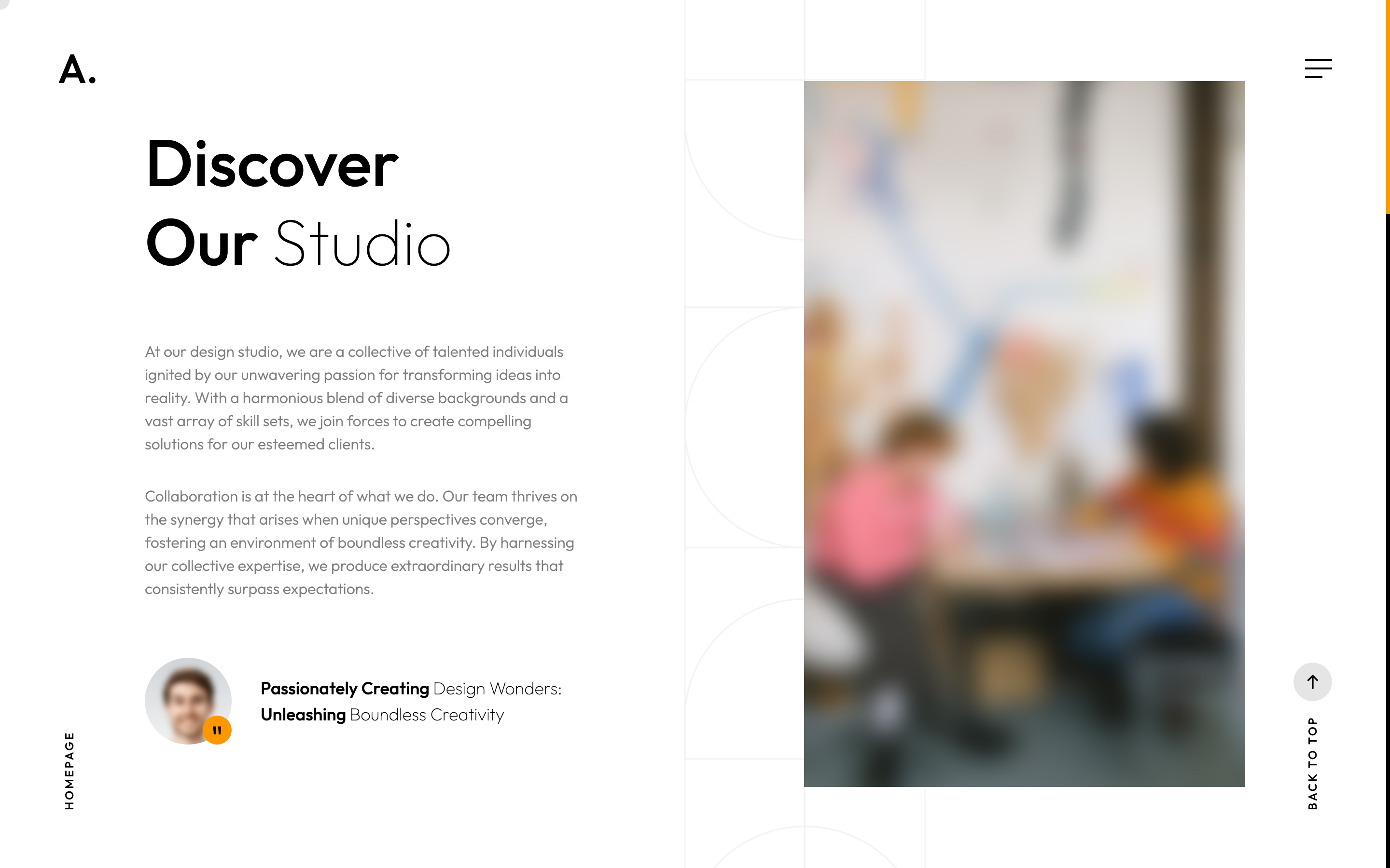
Fixed full-viewport frame container with logo top-left, burger button top-right, and a Back-to-top link plus current-page marker bottom-right. The whole frame is pointer-events: none so only the interactive children catch clicks. Back-to-top fades in once the page is scrolled more than 40% past the top.
HTML structure (minimal)
<div class="mil-frame">
  <div class="mil-frame-top">
    <a href="home-1.html" class="mil-logo">A.</a>
    <div class="mil-menu-btn"><span></span></div>
  </div>
  <div class="mil-frame-bottom">
    <div class="mil-current-page"></div>
    <div class="mil-back-to-top">
      <a href="#top" class="mil-link mil-dark mil-arrow-place"><span>Back to top</span></a>
    </div>
  </div>
</div>
Key SCSS tokens
.mil-frame {
  padding: 50px 60px 60px 60px;
  position: fixed; z-index: 2;
  pointer-events: none;
  display: flex; flex-direction: column; justify-content: space-between;
  width: 100%; height: 100%;
}
.mil-frame-top { display: flex; justify-content: space-between; align-items: center; }
.mil-menu-btn {
  pointer-events: all; height: 28px; cursor: pointer;
  & span, & span:after, & span:before {
    content: ""; display: block; width: 28px; height: 2.5px; background: $dark;
    transition: inherit;
  }
  & span:before { top: -9px; }
  & span:after { width: 18px; top: 9px; }
  &.mil-active span { transform: rotate(45deg); }
}
Animation logic
// back-to-top fades in once you've scrolled 40% of the page
const btt = document.querySelector(".mil-back-to-top .mil-link");
gsap.set(btt, { x: -30, opacity: 0 });
gsap.to(btt, {
  x: 0, opacity: 1, ease: "sine",
  scrollTrigger: { trigger: "body", start: "top -40%", end: "top -40%", toggleActions: "play none reverse none" }
});
Notable details
- Frame is one fixed positioning shell that holds all global UI;
pointer-events: noneon the parent keeps the page hit-testable underneath while children opt in withpointer-events: all. - Burger to X morph: three pseudo-elements rotate independently — the bottom bar shrinks to 18px width then collapses, the top translates and rotates -90deg.
- Current-page indicator is populated at runtime:
.mil-main-menu ul li.mil-active > ais cloned into.mil-current-pageso the bottom-left always echoes the active nav label.
Use when
- You want a chromeless layout where the navigation feels like marginalia on a page rather than a header bar.
- A static HTML / SPA hybrid where the top frame must persist across page transitions (Swup keeps it mounted).
- You need a back-to-top affordance that respects reading position without a hard scroll-down threshold.
Caveats
- Fixed positioning competes with off-canvas menu z-index — the menu uses z-index 9 while frame uses z-index 2; ensure no other fixed elements outrank both.
- Padding
50px 60pxcollapses to30pxbelow 1200px and to0below another 1200px breakpoint duplicate — minor SCSS quirk where the same media query is declared twice.