news-grid
Файли-джерела
- index.html
section.news-section .news-block-one
Summary
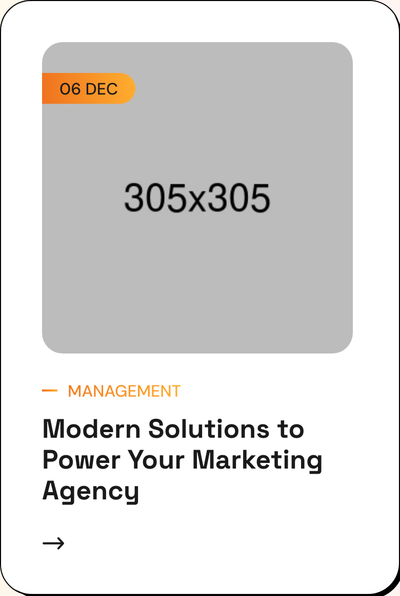
Two-column blog cards inside an asymmetric layout — a left rail with section title and "All Blog" CTA, and a right rail with two news cards. Each card has a date badge stamped over the cover image, a gradient category tag, headline link, and the offset-shadow card frame.
HTML structure (minimal)
<section class="news-section">
  <div class="auto-container">
    <div class="row">
      <div class="col-lg-4 title-column">
        <div class="sec-title">
          <span class="sub-title gradient-color">Our Articles</span>
          <h2>Get More Update from DigMox</h2>
          <a href="blog.html" class="theme-btn btn-one">
            <span class="text">All Blog</span><i class="icon-3"></i>
          </a>
        </div>
      </div>
      <div class="col-lg-8 content-column">
        <div class="content-box">
          <div class="row">
            <div class="col-lg-6 news-block">
              <div class="news-block-one block-shadow">
                <div class="inner-box">
                  <div class="image-box">
                    <figure class="image"><a href="blog-details.html"><img src="news-1.jpg" alt=""></a></figure>
                    <span class="post-date">06 DEC</span>
                  </div>
                  <div class="lower-content">
                    <span class="category gradient-color">Management</span>
                    <h3><a href="blog-details.html">Modern Solutions to Power Your Marketing Agency</a></h3>
                    <div class="link"><a href="blog-details.html"><i class="icon-3"></i></a></div>
                  </div>
                </div>
              </div>
            </div>
            <!-- second .news-block -->
          </div>
        </div>
      </div>
    </div>
  </div>
</section>
Key SCSS tokens
.news-block-one .image-box .post-date {
  position: absolute; left: 20px; top: 20px;
  padding: 6px 14px;
  background: #fff;
  border-radius: 30px;
  font-size: 14px; font-weight: 700;
}
.news-block-one .lower-content .category {
  display: inline-block;
  font-size: 14px; font-weight: 700;
  text-transform: uppercase;
  /* gradient-color clips text */
}
.news-block-one .lower-content h3 {
  font-size: 22px; line-height: 30px;
  margin-bottom: 18px;
}
.news-block-one .lower-content h3 a:hover { color: #EF721F; }

/* .block-shadow primitive (see feature-block.md) */
Notable details
- The title column is
col-lg-4while the cards takecol-lg-8— a magazine-style asymmetric ratio that lets the section heading stand alone. post-dateis rendered as06 DEC(split-line "06" / "DEC" via padding) and overlapped on the cover photo.- Category re-uses
gradient-colorso the small tag echoes the page-wide accent without needing a tinted background. - Card frame is
.block-shadow— same offset-shadow primitive used elsewhere.
Use when
- Marketing-site "latest articles" blocks where you want exactly 2-3 featured posts, not a long list.
- Layouts that have room for a sticky-feeling section title to act as a category anchor.
Caveats
- Two-card limit feels intentional; 4+ cards would need a different layout.
gradient-colortext on small font sizes can render slightly soft on low-DPI screens — fine on mobile / retina, double-check on Windows ClearType.