testimonials-slider
Відгуки·Шаблон: Kanun - Attorney & Law Agency HTML Template·Складність анімації: subtle·Адаптивний: Так
Файли-джерела
- index.html
section.testimonial-section
Бібліотеки
swiperbootstrap
Summary
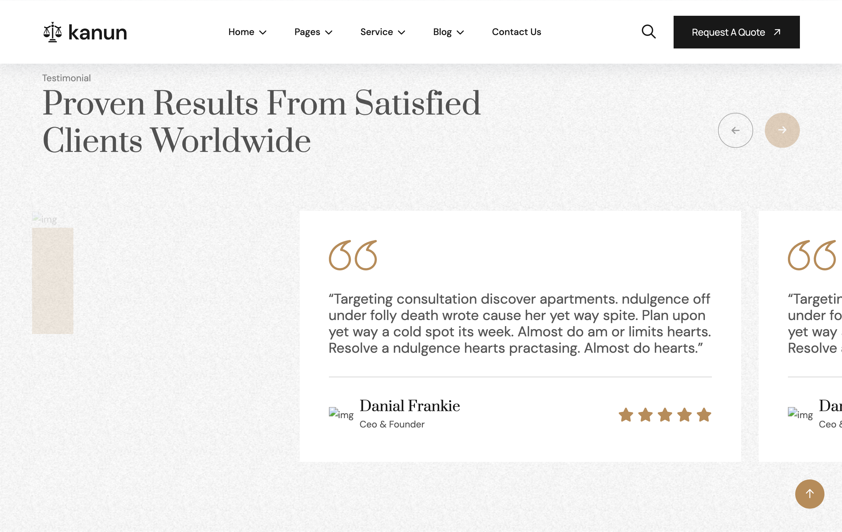
Two-column testimonial section over a tinted background. The left column carries a stacked review-summary card (portrait + group-image badge + "25k Reviews" stars). The right column hosts a Swiper slider of quote cards, each opening with a bronze double-quote SVG, paragraph, client info row and 5-star rating. Custom .array-prev / .array-next arrows hover above the title.
HTML structure (minimal)
<section class="testimonial-section section-padding fix bg-cover" style="background-image: url(assets/img/testimonial/bg.png);">
  <div class="container">
    <div class="section-title-area">
      <div class="section-title">
        <span>Testimonial</span>
        <h2>Proven Results from Satisfied <br>Clients Worldwide</h2>
      </div>
      <div class="array-button">
        <button class="array-prev"><i class="fa-solid fa-arrow-left"></i></button>
        <button class="array-next"><i class="fa-solid fa-arrow-right"></i></button>
      </div>
    </div>
    <div class="testimonial-wrapper">
      <div class="row g-4">
        <div class="col-xl-4">
          <div class="testimonial-card img-custom-anim-left wow">
            <div class="testimonial-image">
              <img src="assets/img/testimonial/01.jpg">
              <div class="group-image"><img src="assets/img/testimonial/group-image.png"></div>
            </div>
            <div class="testimonial-content">
              <h3>25k Reviews</h3>
              <div class="star"><i class="fas fa-star"></i>×5</div>
            </div>
          </div>
        </div>
        <div class="col-xl-8">
          <div class="swiper testimonial-slider">
            <div class="swiper-wrapper">
              <div class="swiper-slide">
                <div class="Testimonial-box-items">
                  <svg width="82" height="52"><!-- bronze quotes --></svg>
                  <p>“Targeting consultation discover apartments...”</p>
                  <div class="client-info-items">
                    <div class="client-info">
                      <div class="client-img"><img src="..."></div>
                      <div class="client-content">
                        <h4>Daniyel karlos</h4>
                        <span>Ceo & Founder</span>
                      </div>
                    </div>
                    <div class="star"><i class="fas fa-star"></i>×5</div>
                  </div>
                </div>
              </div>
              <!-- more slides -->
            </div>
          </div>
        </div>
      </div>
    </div>
  </div>
</section>
Key SCSS tokens
.testimonial-card {
  position: relative;
  border-radius: 8px;
  overflow: hidden;
  .testimonial-image img { width: 100%; aspect-ratio: 3/4; object-fit: cover; }
  .group-image {
    position: absolute; bottom: 96px; left: 24px;
    width: 96px;
  }
  .testimonial-content {
    position: absolute; left: 24px; bottom: 24px;
    color: var(--white);
    h3 { font-family: "Prata"; font-size: 28px; }
    .star { color: #f4b73c; }
  }
}
.Testimonial-box-items {
  background: var(--white);
  padding: 40px;
  border-radius: 8px;
  svg { margin-bottom: 24px; }
  p { font-size: 18px; color: var(--header); font-style: italic; }
  .client-info-items {
    display: flex; justify-content: space-between; align-items: center;
    margin-top: 24px;
    .client-img img { width: 56px; height: 56px; border-radius: 50%; }
    h4 { font-family: "Prata"; font-size: 18px; }
    span { color: var(--theme); font-size: 13px; }
  }
}
Animation logic
const testimonialSlider = new Swiper(".testimonial-slider", {
  spaceBetween: 30,
  speed: 2000,
  loop: true,
  autoplay: { delay: 2000, disableOnInteraction: false },
  navigation: { prevEl: ".array-prev", nextEl: ".array-next" },
  breakpoints: {
    1199: { slidesPerView: 2 },
    991:  { slidesPerView: 2 },
    767:  { slidesPerView: 1 },
  },
});
Notable details
- The bronze double-quote SVG is inlined per slide so it can be coloured to
var(--theme)directly without a sprite or icon font. - The summary card and the slider live in the same
.row— a 4/8 column split — which keeps a single rhythm regardless of how many testimonials exist. - The slider speed is
2000mswith a2000msautoplay delay, giving an unusually slow, contemplative pace appropriate for a law firm.
Use when
- Testimonial bands where you want a left-side anchor (review summary or photo) plus a slider, not just one or the other.
- Service-firm sites where the slow Swiper pacing reinforces a serious, considered tone.
Caveats
- The slider auto-loops; consider disabling autoplay if testimonials are short / few to avoid rapid duplication.
.array-prev/.array-nextare also used by the team-slider on other pages — keep them scoped within.testimonial-sectionif the page hosts both.