donate-form
Форма·Шаблон: Charitics - NGO & Non Profit HTML Template·Складність анімації: subtle·Адаптивний: Так
Файли-джерела
- index.html
section.ul-donate-form-section, .ul-donate-form-section
Summary
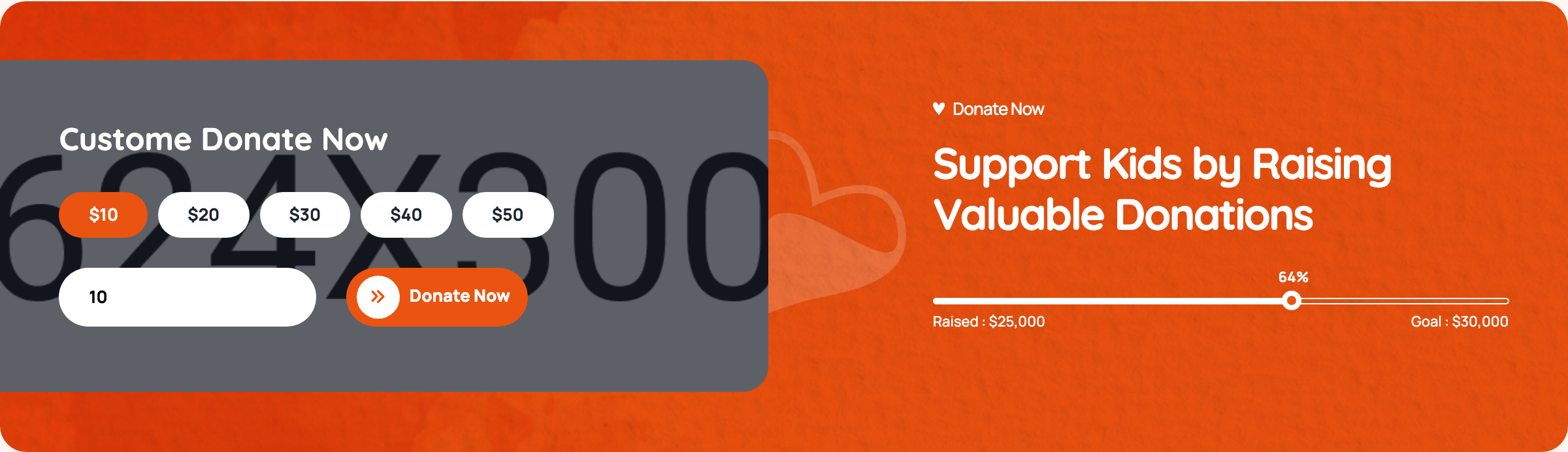
Custom donation widget with five preset radio chips ($10/$20/$30/$40/$50), a sixth pseudo-radio whose label IS a number input for custom amounts, a gradient submit button, and a paired right-side dark panel showing a mirrored progress bar.
HTML structure (minimal)
<div class="ul-section-spacing">
  <div class="ul-container">
    <div class="ul-donate-form-section">
      <div class="row justify-content-between align-items-center">
        <div class="col-lg-6 position-relative">
          <div class="ul-donate-form-wrapper">
            <h3 class="ul-donate-form-title">Custom Donate Now</h3>
            <form action="#" class="ul-donate-form">
              <div>
                <input type="radio" name="donate-amount" id="donate-amount-1" checked hidden>
                <label for="donate-amount-1" class="ul-donate-form-label">$10</label>
              </div>
              <div>
                <input type="radio" name="donate-amount" id="donate-amount-2" hidden>
                <label for="donate-amount-2" class="ul-donate-form-label">$20</label>
              </div>
              <!-- $30, $40, $50 -->
              <div class="custom-amount-wrapper">
                <input type="radio" name="donate-amount" id="custom-amount">
                <label for="donate-amount-custom" class="ul-donate-form-label">
                  <input type="number" name="custom-amount" id="donate-amount-custom"
                         placeholder="Custom Amount" class="ul-donate-form-custom-input">
                </label>
              </div>
              <button type="submit" class="ul-btn">Donate Now</button>
            </form>
          </div>
          <img src="donate-form-vector.svg" class="ul-donate-form-vector">
        </div>

        <div class="col-xl-5 col-lg-6">
          <div class="ul-donate-form-section-txt">
            <span class="ul-section-sub-title text-white">Donate Now</span>
            <h2 class="ul-section-title text-white">Support Kids by Raising Valuable Donations</h2>
            <div class="ul-donation-progress">
              <div class="ul-progress-container">
                <div class="ul-progressbar" data-ul-progress-value="64"><div class="ul-progress-label"></div></div>
              </div>
              <div class="ul-donation-progress-labels">
                <span>Raised : $25,000</span><span>Goal : $30,000</span>
              </div>
            </div>
          </div>
        </div>
      </div>
    </div>
  </div>
</div>
Key SCSS tokens
.ul-donate-form-section {
  background: var(--ul-black);   /* dark cradle */
  border-radius: clamp(16px, 2.10vw, 40px);
  padding: clamp(40px, 4.20vw, 80px);
  position: relative;
}
.ul-donate-form-wrapper {
  background: var(--white);
  padding: clamp(24px, 2.10vw, 40px);
  border-radius: clamp(12px, 1.57vw, 30px);
}
.ul-donate-form {
  display: flex; flex-wrap: wrap; gap: 12px;
}
.ul-donate-form-label {
  border: 2px solid var(--ul-c3);
  padding: 12px 24px;
  border-radius: 999px;
  cursor: pointer;
  font-weight: 700;
  transition: .3s ease;
}
input[type="radio"]:checked + .ul-donate-form-label {
  background: var(--ul-gradient);
  color: var(--white);
  border-color: transparent;
}
.ul-donate-form-custom-input {
  border: none; outline: none;
  width: 110px; font: inherit; color: inherit;
  /* sits inside the label so the label itself is the click target */
}
Animation logic
No JavaScript dedicated to this form — selection is pure CSS via :checked + label. The right-panel progress bar reuses progressbar.js from the donations slider.
Notable details
- The custom-amount slot uses a hidden radio (
#custom-amount) plus a label whoseforpoints to a different element (donate-amount-custom, the number input itself); typing into the input gives focus to it directly while clicking the label area still selects. - Hidden radios mean every chip is purely a label — keyboard users can still tab through because the radios are focusable hidden inputs.
- Progress bar at right reuses the same
.ul-progressbarstructure from donations cards, so one IO observer pattern animates it on scroll. - Surrounding card is layered: dark
--ul-blackshell with rounded corners, white inner form panel, and a decorative SVGdonate-form-vectorpeeking out from a corner.
Use when
- Donation widgets, tip jars, course-purchase pickers needing presets + free amount.
- Pricing pages where "Custom plan" should sit inline with named tiers, not in a separate "Other" link.
- Any radio group where you want the labels themselves to be the visible UI (chips, pills, swatches).
Caveats
- The
id="custom-amount"radio is never explicitly checked when the user types — toggling itscheckedstate via JS would improve form-data semantics. - Submit button has no client-side validation; production needs to gate the request on a valid amount.
- Custom number input does not strip non-numeric input on paste.