reviews-fade-slider
Файли-джерела
- home-1.html
section.mil-soft-bg div.mil-reviews-slider
Бібліотеки
swiperjquery
Summary
Centered fade-effect Swiper testimonials. The pagination is rendered as 110×110 circular avatar bullets via a custom renderBullet, with even-indexed bullets translated 30px down for a wave layout. Slide content (name, source, paragraph) animates in via Swiper parallax (-200px x-offset, opacity 0). A pair of round prev/next buttons sit at top 160px on either side.
HTML structure (minimal)
<section class="mil-soft-bg">
<div class="container mil-p-120-120">
<span class="mil-suptitle mil-suptitle-right mil-suptitle-dark mil-up">Customer reviews are a valuable source…</span>
<h2 class="mil-center mil-up mil-mb-60">Customer <span class="mil-thin">Voices:</span> <br>Hear What <span class="mil-thin">They Say!</span></h2>
<div class="mil-revi-pagination mil-up mil-mb-60"></div>
<div class="row mil-relative justify-content-center">
<div class="col-lg-8">
<div class="mil-slider-nav mil-soft mil-reviews-nav mil-up">
<div class="mil-slider-arrow mil-prev mil-revi-prev mil-arrow-place"></div>
<div class="mil-slider-arrow mil-revi-next mil-arrow-place"></div>
</div>
<svg viewBox="0 0 48 48" class="mil-quote-icon mil-up"><path d="…"/></svg>
<div class="swiper-container mil-reviews-slider">
<div class="swiper-wrapper">
<div class="swiper-slide">
<div class="mil-review-frame mil-center" data-swiper-parallax="-200" data-swiper-parallax-opacity="0">
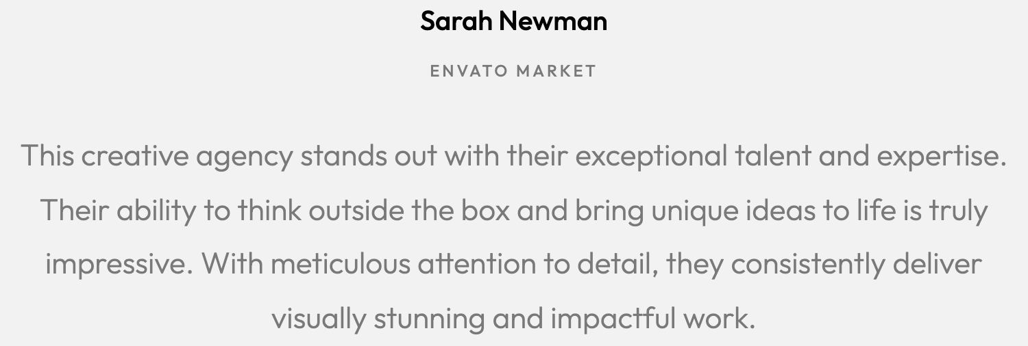
<h5 class="mil-up mil-mb-10">Sarah Newman</h5>
<p class="mil-mb-5 mil-upper mil-up mil-mb-30">Envato market</p>
<p class="mil-text-xl mil-up">This creative agency stands out…</p>
</div>
</div>
<!-- more slides -->
</div>
</div>
</div>
</div>
</div>
</section>
Key SCSS tokens
.mil-revi-pagination {
  display: flex; justify-content: center;
  & .swiper-pagination-bullet {
    padding: 10px; width: 110px; height: 110px;
    opacity: 1; border: none; background-color: transparent;
    margin: 0 !important; transition: $t-md !important;
    &:nth-child(2n) { margin-top: 30px !important; }
    &:hover { box-shadow: inset 0 0 0 4px $light; }
    & .mil-custom-dot {
      width: 90px; height: 90px;
      border-radius: 50%; background-size: cover; background-position: top;
      transition: $t-md !important;
      &.mil-slide-1 { background-image: url(../img/faces/customers/1.jpg); }
      &.mil-slide-2 { background-image: url(../img/faces/customers/2.jpg); }
    }
    &.swiper-pagination-bullet-active { box-shadow: inset 0 0 0 4px $accent; }
  }
}
.mil-quote-icon { width: 40px; height: 40px; & path { fill: $accent; } }
.mil-slider-nav .mil-slider-arrow {
  width: 40px; height: 40px; padding: 10px;
  background-color: $dark; border-radius: 50%;
  &.mil-prev { transform: rotate(180deg); margin-right: 10px; }
  &:hover { transform: scale(1.15); }
  &.mil-prev:hover { transform: rotate(180deg) scale(1.15); }
}
Animation logic
const menu = ['<div class="mil-custom-dot mil-slide-1"></div>',
              '<div class="mil-custom-dot mil-slide-2"></div>',
              /* … */];
new Swiper('.mil-reviews-slider', {
  pagination: {
    el: '.mil-revi-pagination', clickable: true,
    renderBullet: (i, cls) => '<span class="' + cls + '">' + menu[i] + '</span>',
  },
  speed: 800,
  effect: 'fade',
  parallax: true,
  navigation: { nextEl: '.mil-revi-next', prevEl: '.mil-revi-prev' },
});
Notable details
- Avatar bullets serve double duty as visual chooser: the circle is a 90px portrait, and the active state is signalled by an
inset 0 0 0 4px $accentring rather than a fill change. :nth-child(2n)margin-top creates a wave row of bullets — a low-cost way to make a pagination feel composed rather than mechanical.- Slides use Swiper's
data-swiper-parallaxto translate text -200px anddata-swiper-parallax-opacity="0"to fade — combined witheffect: fadethe headlines cross-dissolve while text glides in. - Background images are hard-coded per
.mil-slide-Nmodifier — change customer photos by editing SCSS, not JS.
Use when
- Testimonials where the people are the brand and faces should be the primary nav.
- Smaller slide counts (4–8) where a wave of large avatars reads better than dots.
- Sections that want a magazine-style pull quote feel (large quote icon + centered, generously spaced copy).
Caveats
- Number of bullets is hard-capped at 7 in the JS array (
menuhas 7 entries) — adding an 8th slide breaks renderBullet. - Avatar URLs live in SCSS — adding a person means recompiling SCSS, not just editing markup.
- Below 992px the navigation arrows reflow to top: 0 from top: 160px — verify there is room above the slider on mobile.