hero-banner
Файли-джерела
- index.html
section.ul-banner
Бібліотеки
aos
Summary
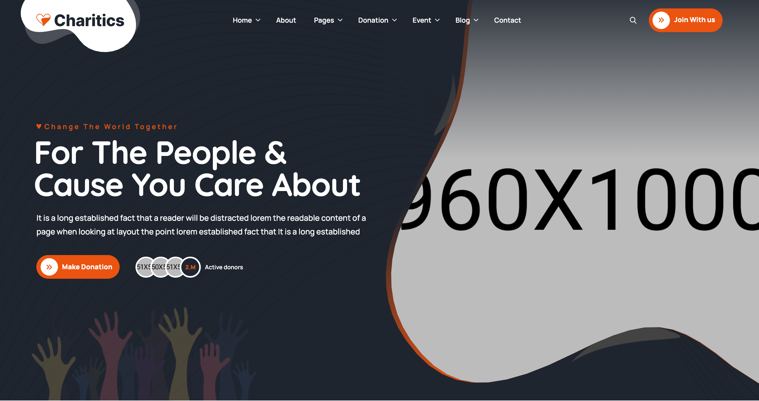
Two-column hero on a near-black background with an organic clip-path framed photo on the right and a sub-title/headline/donate-CTA stack on the left. Includes a stacked active-donors avatar widget, decorative SVG vectors, and a multi-stop orange gradient bleeding around the portrait.
HTML structure (minimal)
<section class="ul-banner">
<div class="ul-banner-container">
<div class="row gy-4 row-cols-lg-2 row-cols-1 align-items-center flex-column-reverse flex-lg-row">
<div class="col">
<div class="ul-banner-txt">
<div class="wow animate__fadeInUp">
<span class="ul-banner-sub-title ul-section-sub-title">Change The World Together</span>
<h1 class="ul-banner-title">For The People & Cause You Care About</h1>
<p class="ul-banner-descr">It is a long established fact ...</p>
<div class="ul-banner-btns">
<a href="donations.html" class="ul-btn">Make Donation</a>
<div class="ul-banner-stat">
<div class="imgs">
<img src="user-1.png" alt=""><img src="user-2.png" alt=""><img src="user-3.png" alt="">
<span class="number">2.M</span>
</div>
<span class="txt">Active donors</span>
</div>
</div>
</div>
<img src="vector-img.png" class="ul-banner-txt-vector">
</div>
</div>
<div class="col align-self-start">
<div class="ul-banner-img">
<div class="img-wrapper"><img src="banner-img.png" alt="Banner"></div>
<div class="ul-banner-img-vectors">
<img src="banner-img-vector-1.png" class="vector-1 wow animate__fadeInRight">
<img src="banner-img-vector-2.png" class="vector-2 wow animate__fadeInDown">
</div>
</div>
</div>
</div>
</div>
</section>
Key SCSS tokens
.ul-banner {
  position: relative;
  background-color: var(--ul-black);
  color: var(--white);
  overflow: hidden;
  &::before {
    content: ""; position: absolute; inset: 0;
    background: url(banner-bg-shape.svg) no-repeat center/cover;
    mix-blend-mode: multiply;
  }
}
.ul-banner-title {
  font-weight: 700;
  font-size: clamp(30px, 4.20vw, 80px);
  font-family: var(--font-quicksand);
  line-height: 100%;
  letter-spacing: -0.02em;
}
.ul-banner-img .img-wrapper {
  background: linear-gradient(180deg, var(--ul-primary) 0%,
                              rgba(235,83,16,0) 51%, var(--ul-primary) 100%);
  padding-left: 10px;
  /* ~80-point organic polygon — see _banner.scss line 125 */
  clip-path: polygon(20.444% 6.836%, 21.079% 1.445% /* ... */, 20.444% 6.836%);
  img { clip-path: /* same polygon */; aspect-ratio: 960/1000; }
}
.ul-banner-stat .imgs > * {
  width: clamp(40px, 2.63vw, 50px);
  border: 3px solid var(--white);
  border-radius: 999px;
  margin-left: -clamp(12px, 0.79vw, 15px);
  background: var(--ul-black);
  color: var(--ul-primary);
}
Animation logic
// WOW.js + Animate.css drive directional reveals
new WOW({}).init();
// HTML class combos:
//   .wow.animate__fadeInUp   — text block
//   .wow.animate__fadeInRight — vector-1 next to portrait
//   .wow.animate__fadeInDown  — vector-2 above portrait
Notable details
- The portrait silhouette uses an ~80-point hand-tuned polygon clip-path duplicated on both wrapper (with 10px padding-left for gradient bleed) and inner image — yields a soft pebble/blob frame instead of a circle.
- Active-donors avatar stack is built with
margin-left: -15pxoverlap andborder: 3px solid white; the trailing.numberspan uses the same shape so "2.M" looks like another avatar. - Background combines a dark
--ul-blackfill, amix-blend-mode: multiplySVG shape on::before, and a fading gradient inside the photo wrapper — three layers of depth without any image filter. flex-column-reverse flex-lg-rowensures mobile stacks the photo above the text (so the hero leads with imagery on small screens).
Use when
- Charity / cause-led landing pages where the portrait of the beneficiary is the emotional anchor.
- Any hero needing organic / hand-drawn feel without going full illustration.
- When you want a "proof" widget (donor count) sitting next to the primary CTA, not pushed into a separate stats strip.
Caveats
- The polygon clip-path is duplicated twice — editing it requires changing both copies.
- Apple Safari occasionally renders complex clip-paths with anti-aliasing artefacts at small sizes.
- Banner image PNG carries the gradient halo; replacing with a flat photo will lose the halo unless you also update the wrapper background.