blog-slider
Картка блогу·Шаблон: Charitics - NGO & Non Profit HTML Template·Складність анімації: subtle·Адаптивний: Так
Файли-джерела
- index.html
section.ul-blogs
Бібліотеки
swiper
Summary
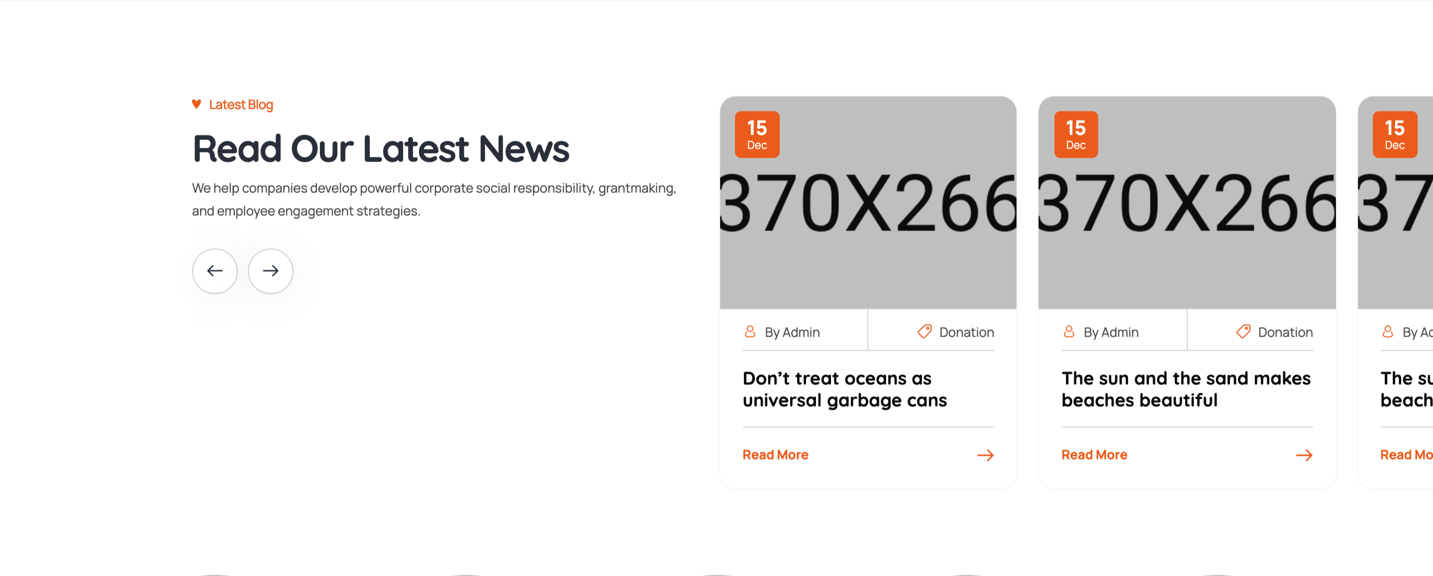
Asymmetric two-column block: section heading, intro paragraph, and arrow nav buttons stacked on the left; a Swiper of blog cards (date badge in image corner, author/category meta row, title link, "Read More" arrow) on the right.
HTML structure (minimal)
<section class="ul-blogs ul-section-spacing">
  <div class="ul-blogs-container wow animate__fadeInUp">
    <div class="row gy-3">
      <div class="col-sm-5">
        <div class="ul-section-heading">
          <div class="left">
            <span class="ul-section-sub-title">Latest Blog</span>
            <h2 class="ul-section-title">Read Our Latest News</h2>
            <p class="ul-section-descr">We help companies develop powerful corporate social responsibility...</p>
            <div class="ul-blogs-slider-nav ul-slider-nav">
              <button class="prev"><i class="flaticon-back"></i></button>
              <button class="next"><i class="flaticon-next"></i></button>
            </div>
          </div>
        </div>
      </div>

      <div class="col-sm-7">
        <div class="ul-blogs-slider swiper">
          <div class="swiper-wrapper">
            <div class="swiper-slide">
              <div class="ul-blog">
                <div class="ul-blog-img">
                  <img src="blog-1.jpg" alt="">
                  <div class="date">
                    <span class="number">15</span>
                    <span class="txt">Dec</span>
                  </div>
                </div>
                <div class="ul-blog-txt">
                  <div class="ul-blog-infos">
                    <div class="ul-blog-info">
                      <span class="icon"><i class="flaticon-account"></i></span>
                      <span class="text">By Admin</span>
                    </div>
                    <div class="ul-blog-info">
                      <span class="icon"><i class="flaticon-price-tag"></i></span>
                      <span class="text">Donation</span>
                    </div>
                  </div>
                  <a href="blog-details.html" class="ul-blog-title">Give Education, It’s The Best Gift Ever.</a>
                  <a href="blog-details.html" class="ul-blog-btn">Read More <span class="icon"><i class="flaticon-next"></i></span></a>
                </div>
              </div>
            </div>
            <!-- more slides -->
          </div>
        </div>
      </div>
    </div>
  </div>
</section>
Key SCSS tokens
.ul-blog {
  background: var(--white);
  border-radius: clamp(8px, 1.05vw, 20px);
  overflow: hidden;
  box-shadow: 0 4px 24px rgba(30,37,47,.06);
}
.ul-blog-img {
  position: relative;
  .date {
    position: absolute; top: 12px; left: 12px;
    background: var(--ul-gradient);
    color: var(--white);
    padding: 8px 12px; border-radius: 8px;
    text-align: center; line-height: 1;
    font-family: var(--font-quicksand);
    .number { font-size: 22px; font-weight: 800; display: block; }
    .txt { font-size: 11px; font-weight: 600; }
  }
}
.ul-blog-infos { display: flex; gap: 16px; margin-bottom: 8px; }
.ul-blog-info {
  display: inline-flex; gap: 6px; align-items: center;
  font-size: 13px; color: var(--ul-p);
  .icon i { color: var(--ul-primary); }
}
.ul-blog-title {
  display: block;
  font-family: var(--font-quicksand);
  font-size: clamp(16px, 1.20vw, 22px);
  font-weight: 700;
  color: var(--ul-black);
  margin-bottom: 16px;
  &:hover { color: var(--ul-primary); }
}
.ul-blog-btn {
  display: inline-flex; align-items: center; gap: 8px;
  color: var(--ul-primary);
  font-weight: 600;
}
Animation logic
// Swiper config (in main.js — full config across breakpoints)
// Heading WOW class drives the section fade.
new Swiper(".ul-blogs-slider", {
  slidesPerView: 2, spaceBetween: 20, autoplay: true, loop: true,
  navigation: {
    prevEl: ".ul-blogs-slider-nav .prev",
    nextEl: ".ul-blogs-slider-nav .next",
  },
  breakpoints: { 0: { slidesPerView: 1 }, 768: { slidesPerView: 2 } }
});
new WOW({}).init();
Notable details
- Heading and slider sit in a 5/7 Bootstrap split, NOT a 6/6 — gives the slider more breathing room and lets the heading occupy a calm vertical column.
- Date badge stacks day-number bold above month abbreviation tiny — the same pattern reused in events grid, so the visual language stays consistent.
- Meta row uses orange icon glyphs against
--ul-ptext — a quick way to make tiny meta items "pop" without losing hierarchy. - "Read More" arrow icon is a separate span so the icon can be styled (or animated on hover) independently.
Use when
- Blog index sections that have a strong intro on the left and want to fit cards in the remaining space.
- Charity/news sites where date and author meta should both be visible at-a-glance.
- When you want navigation buttons grouped with the heading copy, not floating above the slider.
Caveats
- The heading-first asymmetric layout does not reflow gracefully under 576px — heading stacks above slider on mobile.
- Date badge uses the same gradient as the donation tag — to differentiate, override per-slide.