about-block
Можливості·Шаблон: Charitics - NGO & Non Profit HTML Template·Складність анімації: subtle·Адаптивний: Так
Файли-джерела
- index.html
section.ul-about
Бібліотеки
aos
Summary
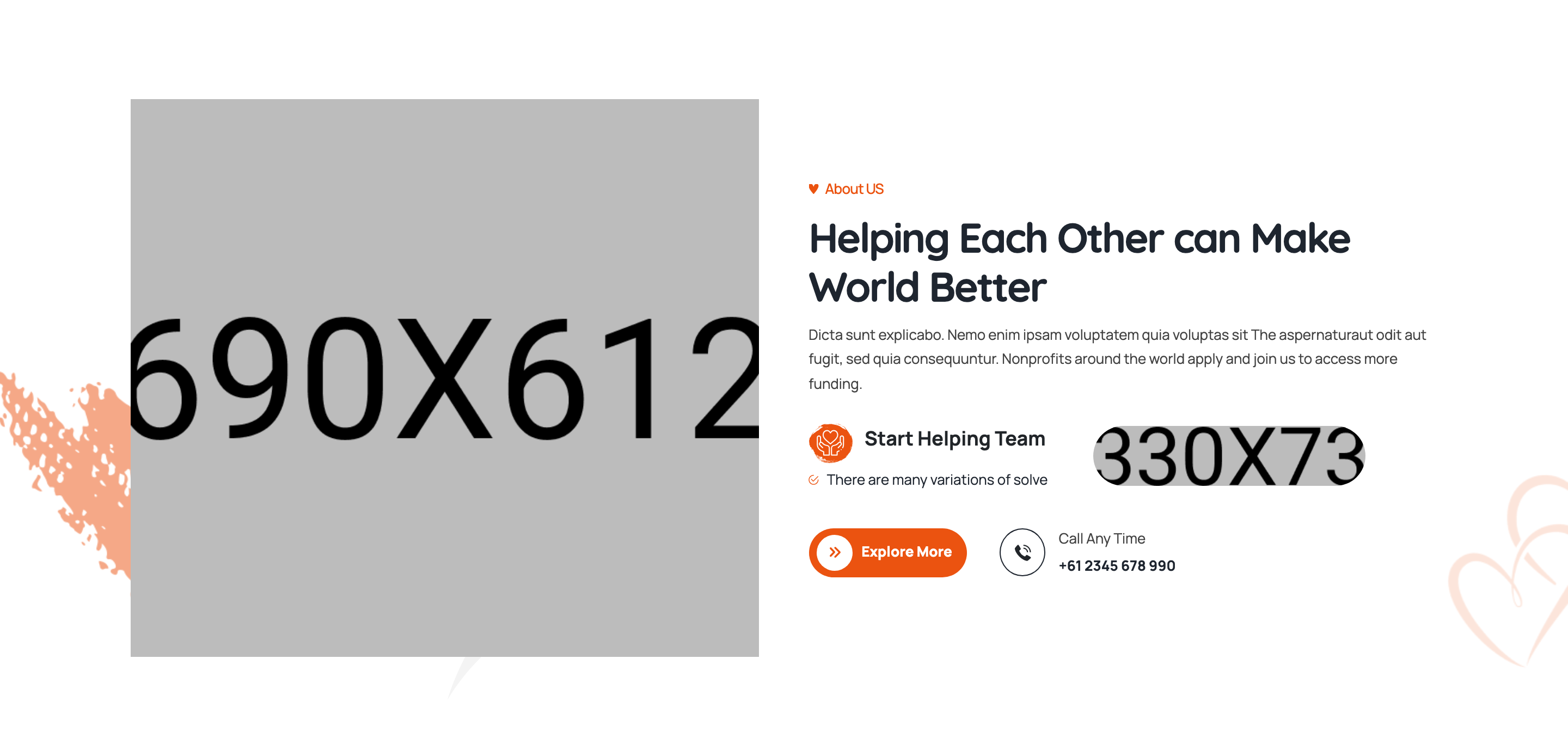
Two-column about section: clip-path framed image plus floating SVG vectors on the left, copy with sub-title, large headline, paragraph, an icon-led "Start Helping Team" callout card, and a primary CTA paired with a phone-call mini widget on the right.
HTML structure (minimal)
<section class="ul-about ul-section-spacing wow animate__fadeInUp">
  <div class="ul-container">
    <div class="row row-cols-md-2 row-cols-1 align-items-center gy-4 ul-about-row">
      <div class="col">
        <div class="ul-about-imgs">
          <div class="img-wrapper"><img src="about-img.png" alt=""></div>
          <div class="ul-about-imgs-vectors">
            <img src="about-img-vector-1.svg" class="vector-1">
            <img src="about-img-vector-2.svg" class="vector-2">
          </div>
        </div>
      </div>
      <div class="col">
        <div class="ul-about-txt">
          <span class="ul-section-sub-title ul-section-sub-title--2">About US</span>
          <h2 class="ul-section-title">Helping Each Other can Make World Better</h2>
          <p class="ul-section-descr">Dicta sunt explicabo...</p>

          <div class="ul-about-block">
            <div class="block-left">
              <div class="block-heading">
                <div class="icon"><i class="flaticon-love"></i></div>
                <h3 class="block-title">Start Helping Team</h3>
              </div>
              <ul class="block-list"><li>There are many variations of solve</li></ul>
            </div>
            <div class="block-right"><img src="about-block-img.jpg" alt=""></div>
          </div>

          <div class="ul-about-bottom">
            <a href="about.html" class="ul-btn">Explore More</a>
            <div class="ul-about-call">
              <div class="icon"><i class="flaticon-telephone-call"></i></div>
              <div class="txt">
                <span class="call-title">Call Any Time</span>
                <a href="tel:+612345678990">+61 2345 678 990</a>
              </div>
            </div>
          </div>
        </div>
      </div>
    </div>
  </div>
  <div class="ul-about-vectors">
    <img src="about-vector-1.png" class="vector-1">
  </div>
</section>
Key SCSS tokens
.ul-about {
  position: relative;
  &-block {
    display: grid;
    grid-template-columns: 1fr auto;
    gap: clamp(16px, 1.57vw, 30px);
    padding: clamp(20px, 1.57vw, 30px);
    background: var(--ul-c4);  /* ivory mist */
    border-left: 4px solid var(--ul-primary);
    border-radius: 8px;
  }
  &-bottom {
    display: flex;
    gap: clamp(20px, 2.10vw, 40px);
    align-items: center;
    margin-top: clamp(20px, 2.10vw, 40px);
  }
  &-call {
    display: flex; gap: 12px; align-items: center;
    .icon {
      width: 50px; aspect-ratio: 1;
      background: var(--ul-gradient);
      color: var(--white);
      border-radius: 50%;
      display: grid; place-items: center;
    }
  }
}
Animation logic
// Section fades in on scroll via WOW.js (class on section)
//   .wow.animate__fadeInUp
new WOW({}).init();
Notable details
- The "Start Helping Team" callout uses a 1fr/auto grid so a small square image hugs the right edge while the icon+title+bullet list fill the remaining space — survives translation length changes well.
- Cream surface (
--ul-c4: #FFF9F4) plus a 4px orange left border gives the card a "pull-quote" feel without a heavy shadow. - Phone CTA uses a circular gradient icon next to a label/link stack — repeat pattern reused in the footer contact bar.
- Two decorative SVG vectors are absolutely positioned around the photo (top-left, bottom-right) and use no animation, just visual rhythm.
Use when
- About sections that need to mix headline copy, an inset feature card, AND a contact CTA without feeling cluttered.
- Charity/agency sites that want a "human" touch via the phone-call mini widget.
- When a flat photo would feel sterile and you need decorative vectors to soften the layout.
Caveats
- Without the orange brand gradient, the call icon loses contrast — keep at least one accent color or substitute a solid fill.
- The
ul-section-sub-title--2modifier expects a leading clip-path SVG glyph; copying without the SCSS partial breaks its visual.