feature-block
Файли-джерела
- index.html
section.feature-section .feature-block-one
Бібліотеки
aosjquery
Summary
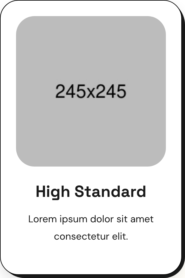
Four-up grid of feature cards. Each card is a white box with a black border, plus a chunky black "shadow" rendered as a sibling pseudo-element offset 5px down and right with asymmetric radii. WOW.js fades each card up on scroll with a stagger.
HTML structure (minimal)
<section class="feature-section centred">
  <div class="auto-container">
    <div class="sec-title">
      <span class="sub-title gradient-color">our Features</span>
      <h2>An expeditious digital agency<br>with simplicity</h2>
    </div>
    <div class="row">
      <div class="col-lg-3 col-md-6 feature-block">
        <div class="feature-block-one wow fadeInUp" data-wow-delay="0ms" data-wow-duration="1500ms">
          <div class="inner-box">
            <figure class="image-box"><img src="feature-1.jpg" alt=""></figure>
            <div class="lower-content">
              <h3><a href="#">High Standard</a></h3>
              <p>Lorem ipsum dolor sit amet consectetur elit.</p>
            </div>
          </div>
        </div>
      </div>
      <!-- 3 more .feature-block columns with delays 200ms, 400ms, 600ms -->
    </div>
  </div>
</section>
Key SCSS tokens
.feature-block-one {
  position: relative;
  padding-right: 5px;
  padding-bottom: 5px;
  margin-bottom: 30px;
}
.feature-block-one::before {
  content: '';
  position: absolute; inset: 0;
  background: var(--secondary-color); /* #1A1A1A */
  border-radius: 30px 40px 34px 40px; /* asymmetric */
}
.feature-block-one .inner-box {
  position: relative;
  padding: 25px;
  border: 1px solid #000;
  border-radius: 30px;
  background: #fff;
  box-shadow: 0px 10px 20px 0px rgba(0, 0, 0, 0.10);
}
.feature-block-one .inner-box .image-box img { transition: all 500ms ease; }
.feature-block-one .inner-box:hover .image-box img { transform: scale(1.05); }
.feature-block-one .inner-box h3 a:hover { color: #EF721F; }
Animation logic
// WOW.js triggers fadeInUp class at scroll-into-view; delays stagger via data-wow-delay.
if ($('.wow').length) {
  var wow = new WOW({ mobile: false });
  wow.init();
}
Notable details
- The "shadow" is not
box-shadowbut a real::beforeelement — that's what lets the offset use asymmetric border-radius (30px 40px 34px 40px) and stay perfectly crisp on retina. - The wrapper has
padding-right: 5px; padding-bottom: 5pxto expose the offset slab; the inner card doesn't need to know about it. - Image hover is a 5% scale with
overflow: hiddenon the parent.image-box, which is the standard "card grows on hover" pattern.
Use when
- Feature grids, capability lists, or service tiles where you want a sturdy editorial look.
- Designs that need a hard offset shadow that respects rounded corners.
- Templates that rebrand often — the offset color is a CSS variable.
Caveats
- WOW.js is jQuery-era; in a modern stack swap for
data-aosor IntersectionObserver. - The 5px offset is hard-coded; matching is a one-shot tweak per design system.
mobile: falsein WOW init means animations don't fire on small screens.