parallax-cta-banner
Файли-джерела
- index.html
section.cta-section
Бібліотеки
jquery
Summary
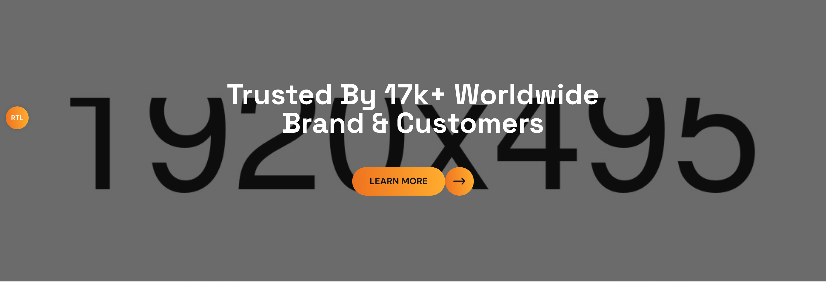
Full-bleed CTA section with a parallax background photo (offset on scroll), a 30% black overlay for legibility, white headline, and the gradient theme button. Identical structure and parallax pattern to the video section, minus the play button.
HTML structure (minimal)
<section class="cta-section centred">
<div class="bg-layer parallax-bg"
data-parallax='{"y": 100}'
style="background-image: url(cta-bg.jpg);"></div>
<div class="auto-container">
<div class="content-box">
<h2>Trusted By 17k+ Worldwide<br>Brand & Customers</h2>
<a href="index.html" class="theme-btn btn-one">
<span class="text">Learn More</span><i class="icon-3"></i>
</a>
</div>
</div>
</section>
Key SCSS tokens
.cta-section { padding: 140px 0px 150px 0px; text-align: center; position: relative; overflow: hidden; }
.cta-section .bg-layer::before {
  content: ''; position: absolute; inset: 0;
  background: #000; opacity: 0.3;
}
.cta-section .content-box h2 {
  font-size: 50px; line-height: 50px; color: #fff;
  margin-bottom: 30px;
}
.parallax-bg {
  position: absolute; left: 0; top: -30%;
  width: 100%; height: calc(100% + 30%);
  background-size: cover;
}

.theme-btn .text {
  border-radius: 50px; padding: 10px 30px;
  background: var(--theme-color);
  font-weight: 700; text-transform: uppercase;
}
.theme-btn:hover .text { color: #fff; }
.theme-btn:hover .text::before { width: 100%; } /* gradient flips on hover */
Animation logic
// Parallax via parallax-scroll.js scanning data-parallax JSON.
// y: 100 means the background moves 100px while the section scrolls past viewport.
Notable details
- Reuses
.parallax-bgand.bg-layer::beforedarken-overlay primitives from the video section — same blueprint, different content. - The button hover uses a sliding gradient
::beforegoing 0% → 100% width, so the orange flips from amber-first to orange-first on hover. - All copy is white, sized big enough to read against any photo, and centred.
Use when
- Mid-page conversion blocks between content sections.
- Any moment that needs a strong "trusted by" or call-to-action interrupting the page flow.
Caveats
- Single-line HTML hero copy — long localized strings may wrap awkwardly.
- The
parallax-scroll.jsplugin doesn't respect prefers-reduced-motion. - Image source URL is inline; a CMS rebuild needs to expose this as an editable field.