team-grid
Команда·Шаблон: Charitics - NGO & Non Profit HTML Template·Складність анімації: subtle·Адаптивний: Так
Файли-джерела
- index.html
section.ul-team
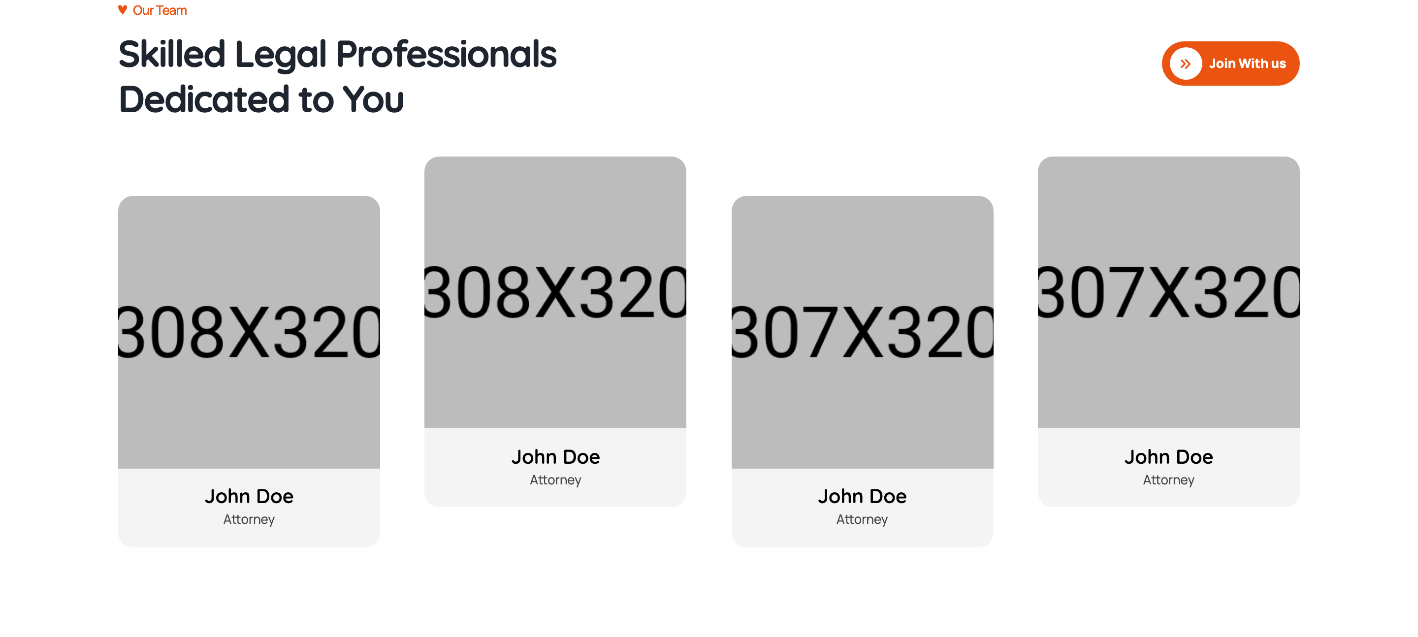
Summary
Four-up team grid with circular cropped portraits. Hover reveals a column of social icons sliding in from the bottom of the photo crop, with name and designation sitting beneath in plain typography.
HTML structure (minimal)
<section class="ul-team ul-section-spacing pt-0">
  <div class="ul-container">
    <div class="ul-section-heading justify-content-between">
      <div class="left">
        <span class="ul-section-sub-title">Our Team</span>
        <h2 class="ul-section-title">Skilled Legal Professionals Dedicated to You</h2>
      </div>
      <div><a href="team.html" class="ul-btn">Join With us</a></div>
    </div>

    <div class="row row-cols-md-4 row-cols-sm-3 row-cols-2 row-cols-xxs-1 ul-team-row justify-content-center">
      <div class="col">
        <div class="ul-team-member">
          <div class="ul-team-member-img">
            <img src="member-1.jpg" alt="">
            <div class="ul-team-member-socials">
              <a href="#"><i class="flaticon-facebook"></i></a>
              <a href="#"><i class="flaticon-twitter"></i></a>
              <a href="#"><i class="flaticon-linkedin-big-logo"></i></a>
              <a href="#"><i class="flaticon-instagram"></i></a>
            </div>
          </div>
          <div class="ul-team-member-info">
            <h3 class="ul-team-member-name"><a href="team-details.html">John Doe</a></h3>
            <p class="ul-team-member-designation">Attorney</p>
          </div>
        </div>
      </div>
      <!-- 3 more cols -->
    </div>
  </div>
</section>
Key SCSS tokens
.ul-team-member-img {
  position: relative;
  border-radius: 50%;            /* circular crop */
  overflow: hidden;
  aspect-ratio: 1/1;

  img { width: 100%; height: 100%; object-fit: cover; }
}
.ul-team-member-socials {
  position: absolute;
  inset: auto 0 0;
  padding: 12px 0;
  display: flex; justify-content: center; gap: 10px;
  background: var(--ul-gradient);
  transform: translateY(100%);     /* hidden below */
  transition: transform .35s ease;
  a {
    width: 32px; height: 32px;
    border-radius: 50%;
    background: var(--white);
    color: var(--ul-primary);
    display: grid; place-items: center;
  }
}
.ul-team-member:hover .ul-team-member-socials {
  transform: translateY(0);        /* reveal on hover */
}
.ul-team-member-name {
  font-family: var(--font-quicksand);
  font-size: clamp(16px, 1.20vw, 22px);
  font-weight: 700;
  margin-top: 16px;
  text-align: center;
  a:hover { color: var(--ul-primary); }
}
.ul-team-member-designation {
  text-align: center;
  color: var(--ul-p);
  font-size: 14px;
}
Notable details
- Social bar is INSIDE the circular crop (clipped by
overflow: hidden), so the slide-up reveal feels like the icons are emerging from inside the portrait, not floating above it. - Gradient orange social bar with white circular icon backdrops creates a strong contrast moment on hover — visually rewarding.
- Name link hover swaps to brand orange — the only color hover state on the card, keeps the interaction minimal.
- Bootstrap row-cols cascade keeps cards tight at all breakpoints (1/2/3/4 cols).
Use when
- Team pages where each member needs social presence without crowding the resting state.
- Lawyer/attorney/agent rosters, charity volunteers, faculty pages.
- When you want a circular portrait grid that still has interactive depth.
Caveats
- Circular crop hides faces near corners — use centered head-and-shoulders portraits or the framing breaks.
- Hover reveal is not exposed on touch devices — consider tap-to-reveal logic or showing socials always on small screens.
- The gradient bar relies on
--ul-gradientbeing defined; copying the component into a different brand requires updating the variable.