services-grid-dark
Файли-джерела
- home-1.html
section.mil-dark-bg div.mil-services-grid
Бібліотеки
gsapscrolltrigger
Summary
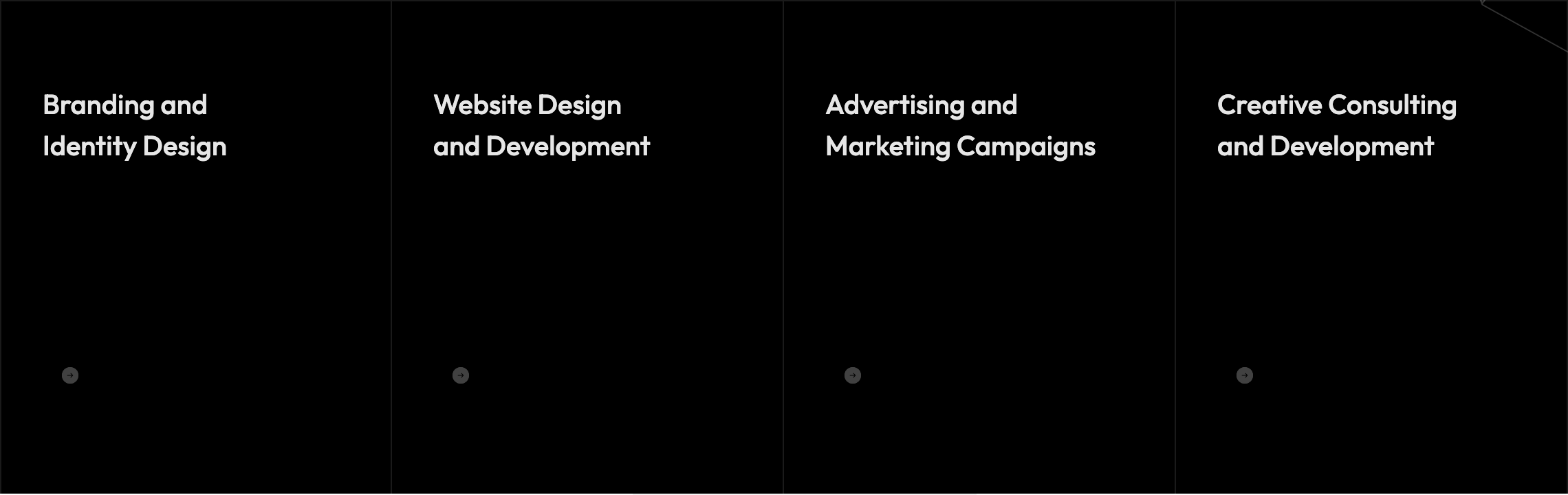
Four-up service cards on a dark section. At rest each card shows only the heading; on hover the description fades-up, the round arrow button scales from 0.3→1 and lifts grayscale, and a 4px accent line sweeps from left to right above the card. Above the grid, an inline hero phrase mixes a 250×80 rounded image into the headline copy ("Unique Ideas — image — For Your Business").
HTML structure (minimal)
<section class="mil-dark-bg">
  <div class="mi-invert-fix">
    <div class="container mil-p-120-0">
      <div class="mil-mb-120">
        <span class="mil-suptitle mil-light-soft mil-suptitle-right mil-up">Professionals focused on helping your brand grow.</span>
        <div class="mil-complex-text justify-content-center mil-up mil-mb-15">
          <span class="mil-text-image"><img src="img/photo/2.jpg" alt="team"></span>
          <h2 class="mil-h1 mil-muted mil-center">Unique <span class="mil-thin">Ideas</span></h2>
        </div>
        <div class="mil-complex-text justify-content-center mil-up">
          <h2 class="mil-h1 mil-muted mil-center">For Your <span class="mil-thin">Business.</span></h2>
          <a href="services.html" class="mil-services-button mil-button mil-arrow-place"><span>What we do</span></a>
        </div>
      </div>
      <div class="row mil-services-grid m-0">
        <div class="col-md-6 col-lg-3 mil-services-grid-item p-0">
          <a href="service.html" class="mil-service-card-sm mil-up">
            <h5 class="mil-muted mil-mb-30">Branding and <br>Identity Design</h5>
            <p class="mil-light-soft mil-mb-30">Our creative agency is a team of professionals…</p>
            <div class="mil-button mil-icon-button-sm mil-arrow-place"></div>
          </a>
        </div>
        <!-- 3 more -->
      </div>
    </div>
  </div>
</section>
Key SCSS tokens
.mil-text-image {
  height: 80px; width: 250px;
  display: inline-block; overflow: hidden; border-radius: 70px; margin-right: 30px;
  & img { width: 100%; height: 100%; object-fit: cover; transition: $t-md; }
  &:hover img { transform: scale(1.05); }
}

.mil-service-card-sm {
  position: relative; display: block; padding: 60px 30px;
  & p { opacity: 0; transform: translateY(10px); transition: $t-md;
        -webkit-line-clamp: 3; display: -webkit-box; -webkit-box-orient: vertical; overflow: hidden; }
  & .mil-button { transform: scale(.3); filter: grayscale(100%); opacity: .4; }
  &:before {
    content: ''; position: absolute; top: 0; left: 0;
    height: 4px; width: 0; background-color: $accent; transition: $t-lg;
  }
  &:hover {
    & p { opacity: 1; transform: translateY(0); }
    & .mil-button { transform: scale(1); filter: grayscale(0); opacity: 1; }
    &:before { width: 100%; }
  }
}

.mil-services-grid {
  border-top: solid 1px $lt-10;
  & .mil-services-grid-item {
    border-right: solid 1px $lt-10;
    &:first-child { border-left: solid 1px $lt-10; }
  }
}
Animation logic
// hover behavior is pure CSS; only the card's section-entrance is GSAP via global .mil-up
// the embedded image-text headline lives inside an .mil-up wrapper so it lifts together
Notable details
- "Image-in-headline" trick: a
display: inline-blockrounded pill the same height as the h2 (80px) sits in the flow of the heading, treating an image like a word. - Three coordinated hover effects on one anchor (text fade, button scale+grayscale, accent line sweep) using only CSS transitions and a
::beforepseudo-element. - On mobile (below 992px) the resting state is forced to the hover state — no need to tap to read the description.
Use when
- Agency service pages where you want hover to reward intent without burying basic info.
- Sections that need to balance dark mood with bright accent moments (the orange line is the only color here).
- You want a magazine-like sentence-with-image headline that animates as a unit.
Caveats
- The image-in-text element hides below 768px (
.mil-text-image { display: none }) — make sure the headline still reads without it. - Cards lose their hover affordance entirely on touch devices because the resting state is replaced; design accordingly.