site-footer
Файли-джерела
- home-1.html
footer.mil-dark-bg
Бібліотеки
gsapscrolltrigger
Summary
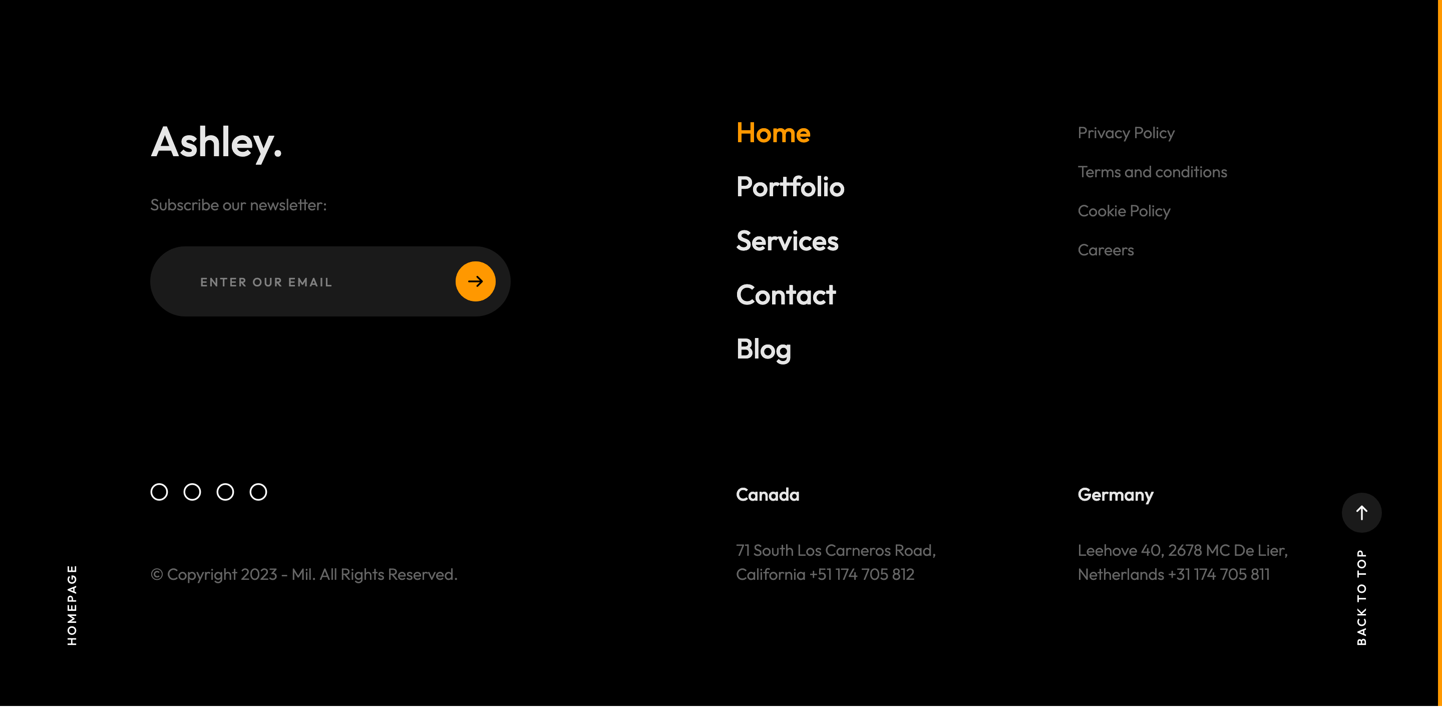
Dark inverted-fix footer split into two rows. Top row: brand "Ashley.", newsletter input with arrow submit, footer nav and a links list. Bottom row (reversed in flex order on small screens) shows two regional contact blocks and a column with social circle icons plus the copyright. The whole footer sits inside the same mi-invert-fix cursor wrapper as the dark hero.
HTML structure (minimal)
<footer class="mil-dark-bg">
  <div class="mi-invert-fix">
    <div class="container mil-p-120-60">
      <div class="row justify-content-between">
        <div class="col-md-4 col-lg-4 mil-mb-60">
          <div class="mil-muted mil-logo mil-up mil-mb-30">Ashley.</div>
          <p class="mil-light-soft mil-up mil-mb-30">Subscribe our newsletter:</p>
          <form class="mil-subscribe-form mil-up">
            <input type="text" placeholder="Enter our email">
            <button type="submit" class="mil-button mil-icon-button-sm mil-arrow-place"></button>
          </form>
        </div>
        <div class="col-md-7 col-lg-6">
          <nav class="mil-footer-menu mil-mb-60">
            <ul>
              <li class="mil-up mil-active"><a href="home-1.html">Home</a></li>
              <li class="mil-up"><a href="portfolio-1.html">Portfolio</a></li>
              <!-- … -->
            </ul>
          </nav>
          <ul class="mil-menu-list mil-up mil-mb-60">
            <li><a href="#." class="mil-light-soft">Privacy Policy</a></li>
          </ul>
        </div>
      </div>
      <div class="row justify-content-between flex-sm-row-reverse">
        <div class="col-md-7 col-lg-6">
          <h6 class="mil-muted mil-up mil-mb-30">Canada</h6>
          <p class="mil-light-soft mil-up">71 South Los Carneros Road, California
            <span class="mil-no-wrap">+51 174 705 812</span></p>
        </div>
        <div class="col-md-4 col-lg-6 mil-mb-60">
          <ul class="mil-social-icons mil-up">
            <li><a href="#." class="social-icon"><i class="far fa-circle"></i></a></li>
          </ul>
          <p class="mil-light-soft mil-up">© Copyright 2023 - Mil. All Rights Reserved.</p>
        </div>
      </div>
    </div>
  </div>
</footer>
Key SCSS tokens
// only the local rules that define this footer's identity
.mil-subscribe-form {
  position: relative;
  & input {
    width: 100%; padding: 15px 60px 15px 0;
    background: transparent; border: none;
    border-bottom: 1px solid $lt-30;
    color: $light;
  }
  & button { position: absolute; right: 0; top: 50%; transform: translateY(-50%); }
}
.mil-footer-menu ul li {
  display: inline-block; margin-right: 30px;
  & a { color: $lt-70; transition: $t-md; }
  &.mil-active a, & a:hover { color: $light; }
}
Animation logic
// each .mil-up element fades + lifts on scroll into the footer
// a second .mil-down or pinning is not used; the footer enters as a normal section.
Notable details
- Newsletter form uses a transparent input with a bottom border only — a popular minimal pattern that fits the editorial restraint of the rest of the page.
- Bottom row is flipped on small screens via
flex-sm-row-reverseso the social/copyright column lands above the regional contacts on phones. - The
mi-invert-fixwrapper triggers the cursor's accent color flip in the same way as the dark hero, keeping the cursor readable across scroll.
Use when
- Multi-region agency sites needing two address blocks side by side with a newsletter.
- Footers that should feel like a continuation of the hero (same dark, same accent) rather than a heavy card.
- Templates where you'd otherwise resort to colored chips — circle social icons plus a single accent color carry enough character.
Caveats
- Social icons are placeholder
<i class="far fa-circle">glyphs — replace with brand icons before deploy. - The footer menu's underline/active marker is
color: $lightonly; consider adding a thin accent line for stronger active state.