team-grid
Команда·Шаблон: Kanun - Attorney & Law Agency HTML Template·Складність анімації: subtle·Адаптивний: Так
Файли-джерела
- index.html
section.team-section
Бібліотеки
bootstrapaos
Summary
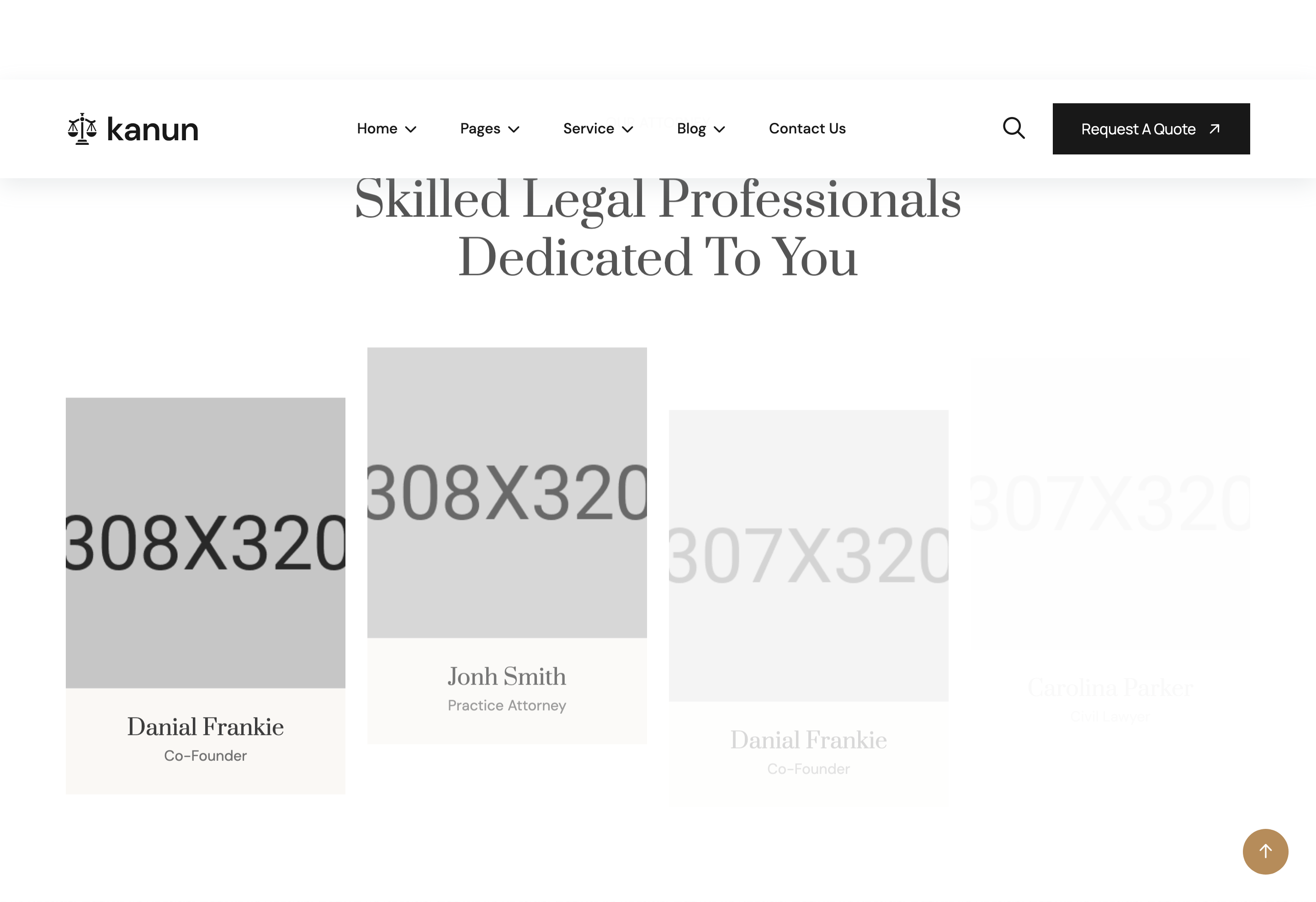
Four-card attorney row. Each card has a portrait image with a hover-reveal column of social icons stacked along one edge, plus a name (linking to team-details.html) and role caption below. Alternate cards apply style-2 which switches the social-stack side and frame treatment.
HTML structure (minimal)
<section class="team-section section-padding fix">
  <div class="container">
    <div class="section-title text-center">
      <span class="sub-title">Our attorney</span>
      <h2>Skilled Legal Professionals <br> Dedicated to You</h2>
    </div>
    <div class="row">
      <div class="col-xl-3 col-lg-4 col-md-6 wow fadeInUp" data-wow-delay=".2s">
        <div class="team-card-items style-2">
          <div class="team-image">
            <img src="assets/img/team/01.jpg" alt="">
            <div class="team-social">
              <a href="#"><i class="fab fa-facebook-f"></i></a>
              <a href="#"><i class="fab fa-twitter"></i></a>
              <a href="#"><i class="fab fa-linkedin-in"></i></a>
              <a href="#"><i class="fa-brands fa-instagram"></i></a>
            </div>
          </div>
          <div class="team-content">
            <h4><a href="team-details.html">Danial Frankie</a></h4>
            <p>Co-Founder</p>
          </div>
        </div>
      </div>
      <!-- 3 more cards -->
    </div>
  </div>
</section>
Key SCSS tokens
.team-card-items {
  text-align: center;
  margin-bottom: 24px;

  .team-image {
    position: relative;
    overflow: hidden;
    border-radius: 6px;
    img { width: 100%; aspect-ratio: 3/4; object-fit: cover; }
  }
  .team-social {
    position: absolute;
    top: 16px; right: -56px;
    display: flex; flex-direction: column; gap: 6px;
    transition: 0.4s;
    a {
      width: 40px; height: 40px;
      background: var(--white); color: var(--theme);
      border-radius: 50%;
      display: grid; place-items: center;
    }
  }
  &:hover .team-social { right: 16px; }

  .team-content {
    padding-top: 20px;
    h4 a { font-family: "Prata"; color: var(--header); font-size: 22px; }
    p { color: var(--theme); font-size: 14px; letter-spacing: 0.12em; }
  }

  &.style-2 .team-social { left: -56px; right: auto; }
  &.style-2:hover .team-social { left: 16px; }
}
Animation logic
// Cards stagger in via WOW.js with `.2s / .4s / .6s / .7s` delays.
// Hover state is pure CSS (`right` slide-in for default, `left` for style-2).
Notable details
- The social column slides in horizontally instead of fading — the off-canvas resting position (
right: -56px) keeps the portrait clean by default. .style-2mirror-flips the social column's anchor side, so an even/odd alternation across the row creates symmetry around the centre.- Aspect-ratio
3/4keeps all portraits exactly the same size regardless of source crops.
Use when
- Law / agency / clinic team pages where you want a clean portrait grid with social affordance only on hover.
- Any 4-up team band that benefits from alternating decorative variants.
Caveats
- The off-canvas social column relies on
overflow: hiddenon.team-image— removing that style exposes the icons by default.