donations-slider
Картка послуги·Шаблон: Charitics - NGO & Non Profit HTML Template·Складність анімації: medium·Адаптивний: Так
Файли-джерела
- index.html
section.ul-donations
Бібліотеки
swiper
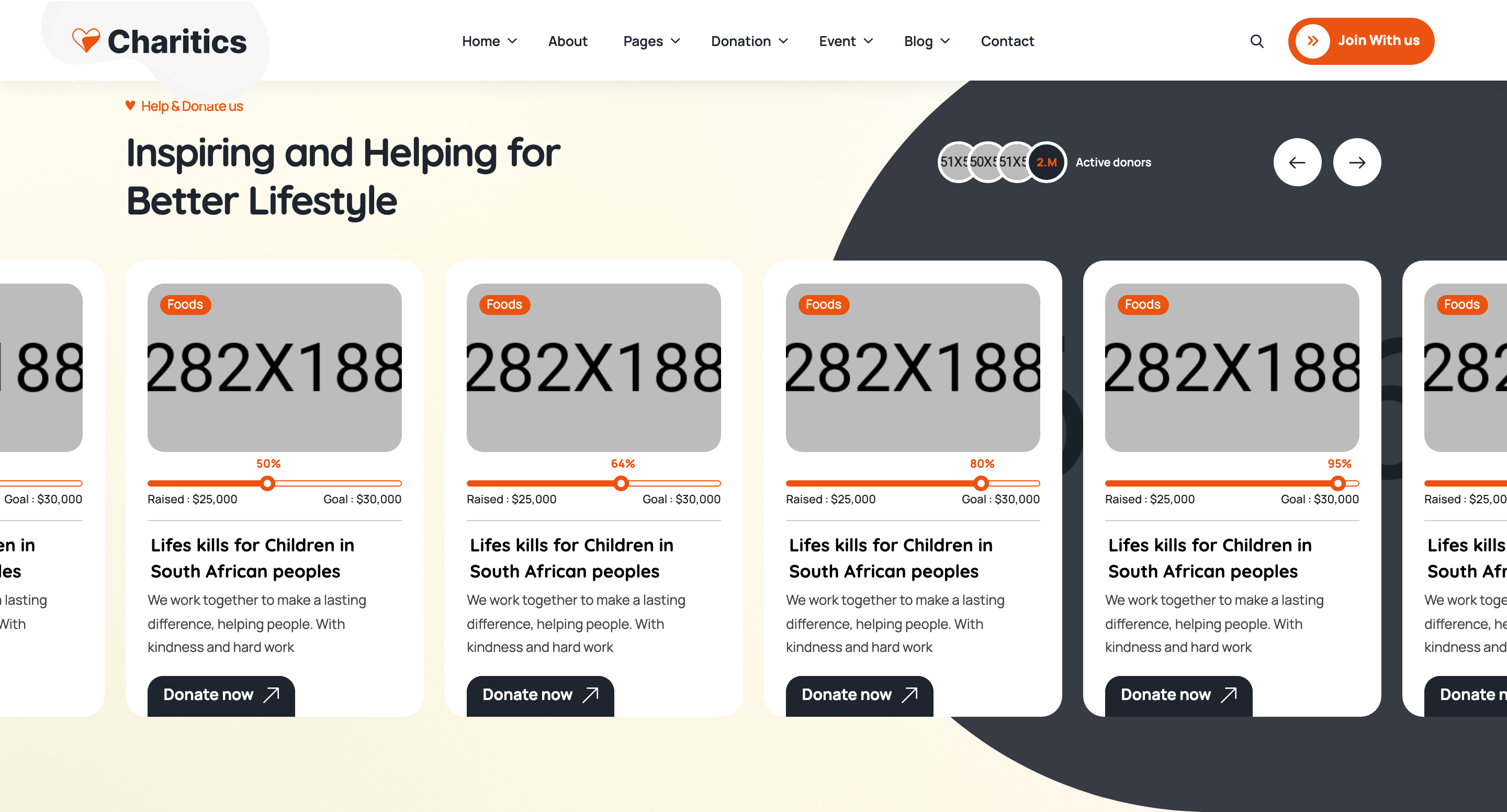
Summary
Swiper carousel of donation campaign cards. Each card stacks a tagged photo, an animated horizontal progress bar with raised/goal labels, the campaign title, a one-paragraph blurb, and an arrow CTA. Custom prev/next buttons sit in the section heading.
HTML structure (minimal)
<section class="ul-donations ul-section-spacing">
<div class="ul-container">
<div class="ul-section-heading ul-donations-heading text-center">
<div class="left">
<span class="ul-section-sub-title">Help & Donate us</span>
<h2 class="ul-section-title">Inspiring and Helping for Better Lifestyle</h2>
</div>
<div class="ul-slider-nav ul-donations-slider-nav">
<button class="prev"><i class="flaticon-back"></i></button>
<button class="next"><i class="flaticon-next"></i></button>
</div>
</div>
</div>
<div class="ul-container">
<div class="ul-donations-slider swiper overflow-visible">
<div class="swiper-wrapper">
<div class="swiper-slide">
<div class="ul-donation">
<div class="ul-donation-img">
<img src="donation-1.jpg" alt="">
<span class="tag">Foods</span>
</div>
<div class="ul-donation-txt">
<div class="ul-donation-progress">
<div class="donation-progress-container ul-progress-container">
<div class="donation-progressbar ul-progressbar" data-ul-progress-value="55">
<div class="donation-progress-label ul-progress-label"></div>
</div>
</div>
<div class="ul-donation-progress-labels">
<span>Raised : $25,000</span>
<span>Goal : $30,000</span>
</div>
</div>
<a href="donation-details.html" class="ul-donation-title">Lifeskills for Children...</a>
<p class="ul-donation-descr">We work together...</p>
<a href="donation-details.html" class="ul-donation-btn">Donate now <i class="flaticon-up-right-arrow"></i></a>
</div>
</div>
</div>
<!-- repeat .swiper-slide -->
</div>
</div>
</div>
</section>
Key SCSS tokens
.ul-donation {
  background: var(--white);
  border-radius: clamp(8px, 1.05vw, 20px);
  overflow: hidden;
  box-shadow: 0 4px 24px rgba(30,37,47,.06);
}
.ul-donation-img {
  position: relative;
  .tag {
    position: absolute; top: 12px; left: 12px;
    background: var(--ul-gradient);
    color: var(--white);
    padding: 4px 12px; border-radius: 999px;
    font-size: 13px; font-weight: 600;
  }
}
.ul-progress-container {
  position: relative;
  height: 8px;
  background: var(--ul-c3);   /* warm cream rail */
  border-radius: 999px;
  overflow: hidden;
}
.ul-progressbar {
  height: 100%;
  background: var(--ul-gradient);
  border-radius: 999px;
  width: 0;        /* JS animates to data-ul-progress-value */
  transition: none; /* width set per RAF tick */
}
.ul-progress-label {
  position: absolute; right: 0; top: -22px;
  font-size: 12px; font-weight: 700;
  color: var(--ul-primary);
}
Animation logic
// progressbar.js — counts up when bar enters viewport
const progressBars = document.querySelectorAll('.ul-progressbar');
progressBars.forEach(bar => {
  const target = parseInt(bar.dataset.ulProgressValue, 10);
  const label = bar.querySelector(".ul-progress-label");
  let current = 0;
  const io = new IntersectionObserver(entries => {
    entries.forEach(e => {
      if (!e.isIntersecting) return;
      const tick = () => {
        if (current < target) {
          current++;
          bar.style.width = `${current}%`;
          label.textContent = `${current}%`;
          requestAnimationFrame(tick);
        }
      };
      tick();
      io.unobserve(bar);
    });
  });
  io.observe(bar);
});

// main.js — Swiper config
new Swiper(".ul-donations-slider", {
  slidesPerView: 6, spaceBetween: 20, autoplay: true,
  navigation: {
    prevEl: ".ul-donations-slider-nav .prev",
    nextEl: ".ul-donations-slider-nav .next",
  },
  breakpoints: {
    0: { slidesPerView: 1.2, centeredSlides: true },
    480: { slidesPerView: 1.7, centeredSlides: true },
    576: { slidesPerView: 2 },
    /* ... up to 6 ... */
  }
});
Notable details
- Each progress bar runs its own IntersectionObserver and unsubscribes after firing once — bars never re-animate when scrolling back.
data-ul-progress-valuelives on the bar element and feeds both the inline width style and the textContent of the floating label, keeping markup and value in sync.- The progress label is absolutely positioned ABOVE the rail, anchored to the moving fill via
right: 0of the inner element — so the percentage tag travels with the fill edge. - Swiper config shows mobile uses fractional
slidesPerView: 1.2+centeredSlidesfor a peek-of-next-card effect, then jumps to integer slide counts at desktop.
Use when
- Fundraising listings with explicit goal amounts.
- Course progress meters, project completion meters, KPI dashboards needing scroll-triggered count-ups.
- Any card carousel where you want a peek-into-next slide on mobile.
Caveats
- The progress fill is set per-frame inline, ignoring CSS transitions — if you want easing, switch to a CSS transition + setting width once.
- Slider config in
main.jsis the same shared file across all home pages; togglingloop: trueis commented out by author (// loop: true). - Tag colors are hard-coded to the orange gradient — multi-category schemes need additional modifier classes.