events-grid
Картка послуги·Шаблон: Charitics - NGO & Non Profit HTML Template·Складність анімації: subtle·Адаптивний: Так
Файли-джерела
- index.html
section.ul-events
Бібліотеки
aos
Summary
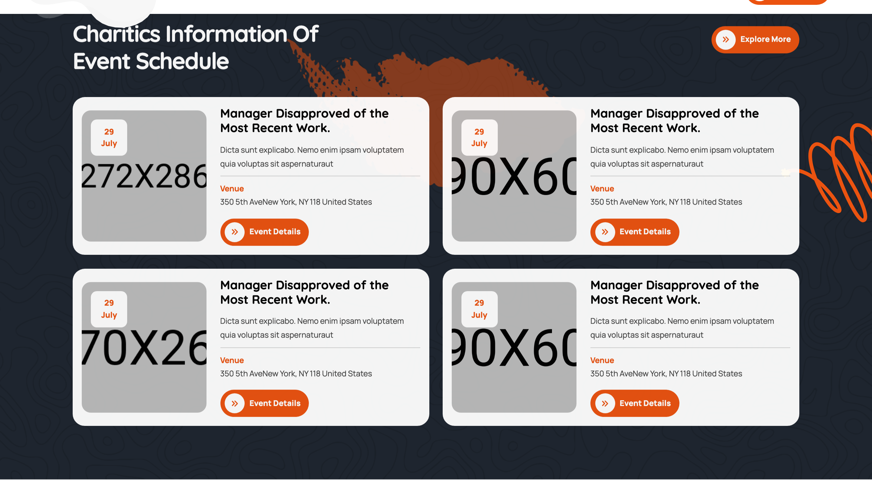
Two-by-two events grid on a dark backdrop with photographic banners, an overlapping date-badge tile, venue meta, and an event-details CTA per card. Each cell fades up on scroll.
HTML structure (minimal)
<section class="ul-events ul-section-spacing pt-0">
  <div class="ul-container">
    <div class="ul-section-heading align-items-center wow animate__fadeInUp">
      <div class="left">
        <span class="ul-section-sub-title">Upcoming Events</span>
        <h2 class="ul-section-title text-white">Charitics Information Of Event Schedule</h2>
      </div>
      <a href="events.html" class="ul-btn">Explore More</a>
    </div>

    <div class="ul-events-wrapper">
      <div class="row ul-bs-row row-cols-lg-2 row-cols-1">
        <div class="col wow animate__fadeInUp">
          <div class="ul-event">
            <div class="ul-event-img">
              <img src="event-img.jpg" alt="">
              <span class="date">29 <span>July</span></span>
            </div>
            <div class="ul-event-txt">
              <h3 class="ul-event-title"><a href="event-details.html">Manager Disapproved...</a></h3>
              <p class="ul-event-descr">Dicta sunt explicabo...</p>
              <div class="ul-event-info">
                <span class="ul-event-info-title">Venue</span>
                <p class="ul-event-info-descr">350 5th Ave New York, NY 118</p>
              </div>
              <a href="event-details.html" class="ul-btn">Event Details</a>
            </div>
          </div>
        </div>
        <!-- 3 more .col -->
      </div>
    </div>
  </div>
  <div class="ul-events-vectors">
    <img src="events-vector-1.png" class="vector-1">
    <img src="events-vector-2.svg" class="vector-2">
  </div>
</section>
Key SCSS tokens
.ul-events {
  background: var(--ul-black);
  position: relative;
  z-index: 1;
}
.ul-event {
  display: grid;
  grid-template-columns: clamp(180px, 22vw, 320px) 1fr;
  gap: clamp(16px, 2.10vw, 40px);
  background: rgba(255,255,255,.04);
  border-radius: clamp(8px, 1.05vw, 20px);
  padding: clamp(16px, 1.57vw, 24px);
}
.ul-event-img {
  position: relative;
  border-radius: 12px;
  overflow: hidden;
  .date {
    position: absolute;
    top: 12px; left: 12px;
    background: var(--ul-gradient);
    color: var(--white);
    font-family: var(--font-quicksand);
    font-weight: 800;
    padding: 8px 12px;
    border-radius: 8px;
    text-align: center;
    line-height: 1;
    span { display: block; font-size: 12px; font-weight: 600; }
  }
}
.ul-event-info {
  display: flex; gap: 8px;
  padding: 12px 0;
  border-top: 1px dashed rgba(255,255,255,.15);
  border-bottom: 1px dashed rgba(255,255,255,.15);
}
Animation logic
// Each .col carries .wow.animate__fadeInUp — staggered scroll-reveal
new WOW({}).init();
Notable details
- Card layout is a 2-column grid (image | text) so cards remain horizontal on desktop and stack vertically on mobile via Bootstrap row-cols.
- Date badge stacks "29" big and "July" small, all inside one gradient pill — readable as a calendar marker even at thumbnail size.
- Dashed top + bottom borders on the venue info row are the only horizontal dividers in the card, marking it as the "metadata" section without a heavy line.
- Section background is fully dark, so this is one of the few places where a subtle white-alpha card surface (
rgba(255,255,255,.04)) is used — matches the wider charity-template pattern of light/dark band alternation.
Use when
- Event listings, conference schedules, donation drives with a date.
- Any "upcoming" section where you need both a thumbnail and structured meta (date + venue + CTA).
- Sections that want to break the cream/light page rhythm with a dark band.
Caveats
- The 4-up grid with
row-cols-lg-2results in a 2x2 desktop layout — to show 4 across, switch torow-cols-lg-4. - White-alpha card backgrounds depend on a dark section behind them — placing the card on a light section will make them invisible.