fade-banner-carousel
Файли-джерела
- index.html
section.banner-section .banner-carousel
Бібліотеки
jqueryswiper
Summary
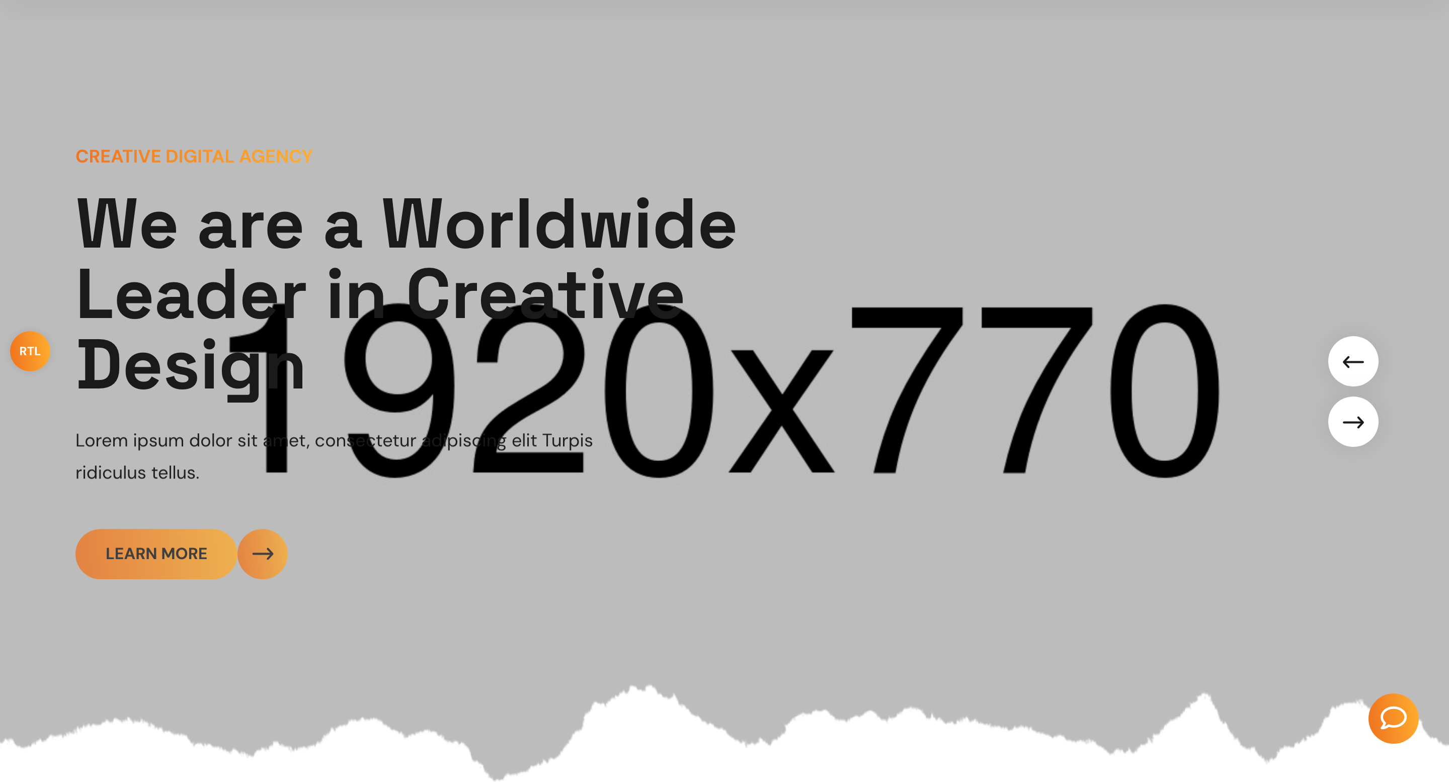
Hero slider that crossfades between full-bleed background images while the active slide's photo slowly Ken-Burns-zooms to scale(1.25) over 8 seconds. Each subhead, headline, paragraph, and button fades and slides in on its own delay so the copy ladders into place. Built on Owl Carousel.
HTML structure (minimal)
<section class="banner-section">
  <div class="pattern-layer" style="background-image: url(shape-1.png);"></div>
  <div class="banner-carousel owl-theme owl-carousel">
    <div class="slide-item">
      <div class="bg-layer" style="background-image: url(banner-1.jpg);"></div>
      <div class="auto-container">
        <div class="content-box">
          <span class="upper-text gradient-color">Creative Digital Agency</span>
          <h2>We are a Worldwide Leader in Creative Design</h2>
          <p>Lorem ipsum dolor sit amet…</p>
          <div class="btn-box">
            <a href="#" class="theme-btn btn-one"><span class="text">Learn More</span><i class="icon-3"></i></a>
          </div>
        </div>
      </div>
    </div>
    <!-- repeat .slide-item ... -->
  </div>
</section>
Key SCSS tokens
.banner-carousel .slide-item .bg-layer {
  position: absolute; inset: 0;
  background-size: cover; background-position: center;
  transform: scale(1);
  transition: all 8000ms linear;
}
.banner-carousel .active .slide-item .bg-layer { transform: scale(1.25); }

.banner-carousel .content-box .upper-text,
.banner-carousel .content-box h2,
.banner-carousel .content-box p,
.banner-carousel .content-box .btn-box {
  opacity: 0; transform: translateY(50px);
  transition: all 1000ms ease;
}
.banner-carousel .active .content-box .upper-text { transform: translateY(0); opacity: 1; transition-delay: 1000ms; }
.banner-carousel .active .content-box h2          { transform: translateY(0); opacity: 1; transition-delay: 700ms; }
.banner-carousel .active .content-box p           { transform: translateY(0); opacity: 1; transition-delay: 1000ms; }
.banner-carousel .active .content-box .btn-box    { transform: translateY(0); opacity: 1; transition-delay: 1300ms; }

.banner-carousel .content-box h2 { font-size: 70px; line-height: 70px; }
Animation logic
$('.banner-carousel').owlCarousel({
  loop: true,
  margin: 0,
  nav: true,
  animateOut: 'fadeOut',
  animateIn: 'fadeIn',
  smartSpeed: 1000,
  autoplay: 6000,
  navText: ['<span class="icon-2"></span>', '<span class="icon-3"></span>'],
  responsive: { 0: { items: 1 }, 1024: { items: 1 } }
});
Notable details
transition: all 8000ms linearon.bg-layeris what produces the Ken-Burns effect — the photo zoom outlasts the 6s autoplay so a new slide always fades in over a still-zooming background.- The headline lands first (700ms) and the eyebrow + paragraph land later (1000ms), inverting the natural reading order to sell the headline first.
gradient-colorclass clips the brand gradient onto the eyebrow text via-webkit-background-clip: text.
Use when
- Cinematic agency or product hero sliders with strong photography.
- When you need movement on a still photo without paying for video.
- Hero rotators that need to feel calm rather than aggressive.
Caveats
- Owl Carousel is a jQuery plugin; if you migrate to a modern stack you'll likely swap to Swiper or Embla.
- The 8s background transition starts when
.activeis set, so cycling faster than 8s makes the zoom feel jumpy. - Three slides duplicated with identical text — typical template placeholder, replace per project.