gallery-marquee
Бігучий рядок·Шаблон: Charitics - NGO & Non Profit HTML Template·Складність анімації: medium·Адаптивний: Так
Файли-джерела
- index.html
div.ul-gallery
Бібліотеки
swiper
Summary
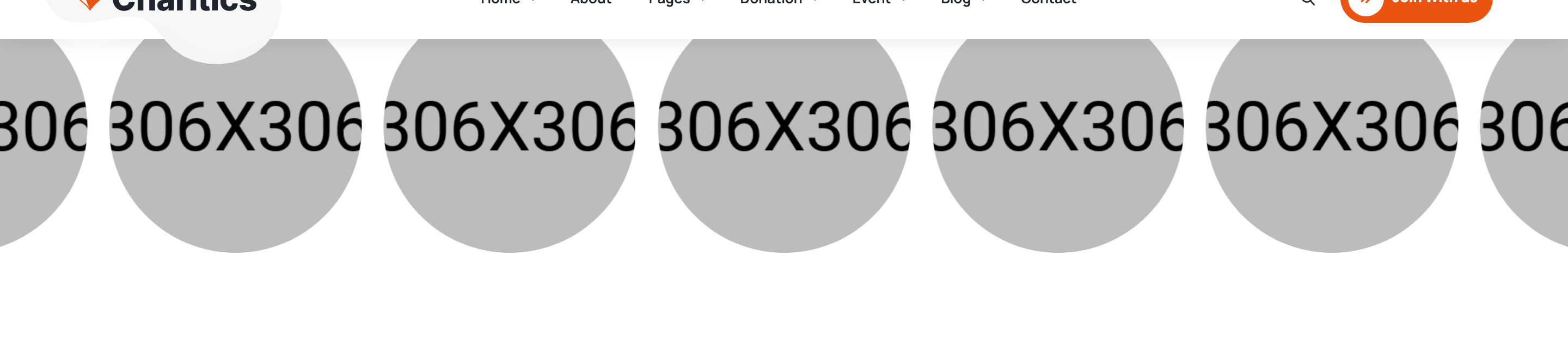
Edge-to-edge auto-playing centred Swiper of square gallery photos with hover-reveal Instagram-icon lightbox triggers (fsLightbox). Adjacent slides bleed off both viewport edges for a continuous-ribbon feel.
HTML structure (minimal)
<div class="ul-gallery overflow-hidden ul-section-spacing mx-auto pt-0">
  <div class="ul-gallery-slider swiper">
    <div class="swiper-wrapper">
      <div class="ul-gallery-item swiper-slide">
        <img src="gallery-item-1.png" alt="">
        <div class="ul-gallery-item-btn-wrapper">
          <a href="gallery-item-1.png" data-fslightbox="gallery">
            <i class="flaticon-instagram"></i>
          </a>
        </div>
      </div>
      <!-- more slides -->
    </div>
  </div>
</div>
Key SCSS tokens
.ul-gallery-item {
  position: relative;
  border-radius: clamp(8px, 1.05vw, 16px);
  overflow: hidden;
  aspect-ratio: 1/1;

  img {
    width: 100%; height: 100%;
    object-fit: cover;
    transition: transform .5s ease;
  }

  &:hover img { transform: scale(1.05); }
}
.ul-gallery-item-btn-wrapper {
  position: absolute;
  inset: 0;
  background: rgba(235,83,16,.6);    /* orange overlay */
  display: grid; place-items: center;
  opacity: 0;
  transition: opacity .35s ease;

  a {
    width: 56px; height: 56px;
    border-radius: 50%;
    background: var(--white);
    color: var(--ul-primary);
    display: grid; place-items: center;
    transform: translateY(10px);
    transition: transform .35s ease;
  }
}
.ul-gallery-item:hover .ul-gallery-item-btn-wrapper {
  opacity: 1;
  a { transform: translateY(0); }
}
Animation logic
new Swiper(".ul-gallery-slider", {
  slidesPerView: 2.2, spaceBetween: 15,
  loop: true, autoplay: true, centeredSlides: true,
  breakpoints: {
    480: { slidesPerView: 3.4 },
    576: { slidesPerView: 4 },
    768: { slidesPerView: 5 },
    992: { slidesPerView: 5.8, spaceBetween: 20 },
    1680: { slidesPerView: 5.8, spaceBetween: 26 },
    1700: { slidesPerView: 5.8, spaceBetween: 30 }
  }
});
// fsLightbox auto-binds to elements with data-fslightbox=...
Notable details
- Fractional
slidesPerView: 5.8pluscenteredSlidesproduces an always-moving ribbon where the active tile is centred and neighbours bleed off both edges — a magazine-style marquee without writing CSS keyframes. - Hover overlay uses a 60%-opacity orange tint plus a white circular icon button that translates up — two-axis hover animation with no JS.
- All tiles share
data-fslightbox="gallery", so fsLightbox treats them as a single navigable lightbox group. - Gallery sits in
.overflow-hiddenso the bleeding slides on either edge don't leak horizontal scrollbar.
Use when
- Photo galleries, partner walls, before/after grids that benefit from a continuous focal-point ribbon.
- Charity / NGO impact photo strips between content sections.
- When you want a CSS-only marquee feel but need controllable navigation/autoplay (Swiper does both).
Caveats
- fsLightbox is loaded as a separate vendor file — must be present for the lightbox to work, otherwise links fall through to direct image URL.
- Autoplay continues even on hover; if you want pause-on-hover, add
autoplay: { disableOnInteraction: false, pauseOnMouseEnter: true }. - Loop + centered slides can occasionally jitter on resize as Swiper recalculates the centring offset.