testimonials-slider
Відгуки·Шаблон: Charitics - NGO & Non Profit HTML Template·Складність анімації: subtle·Адаптивний: Так
Файли-джерела
- index.html
section.ul-testimonial
Бібліотеки
swiper
Summary
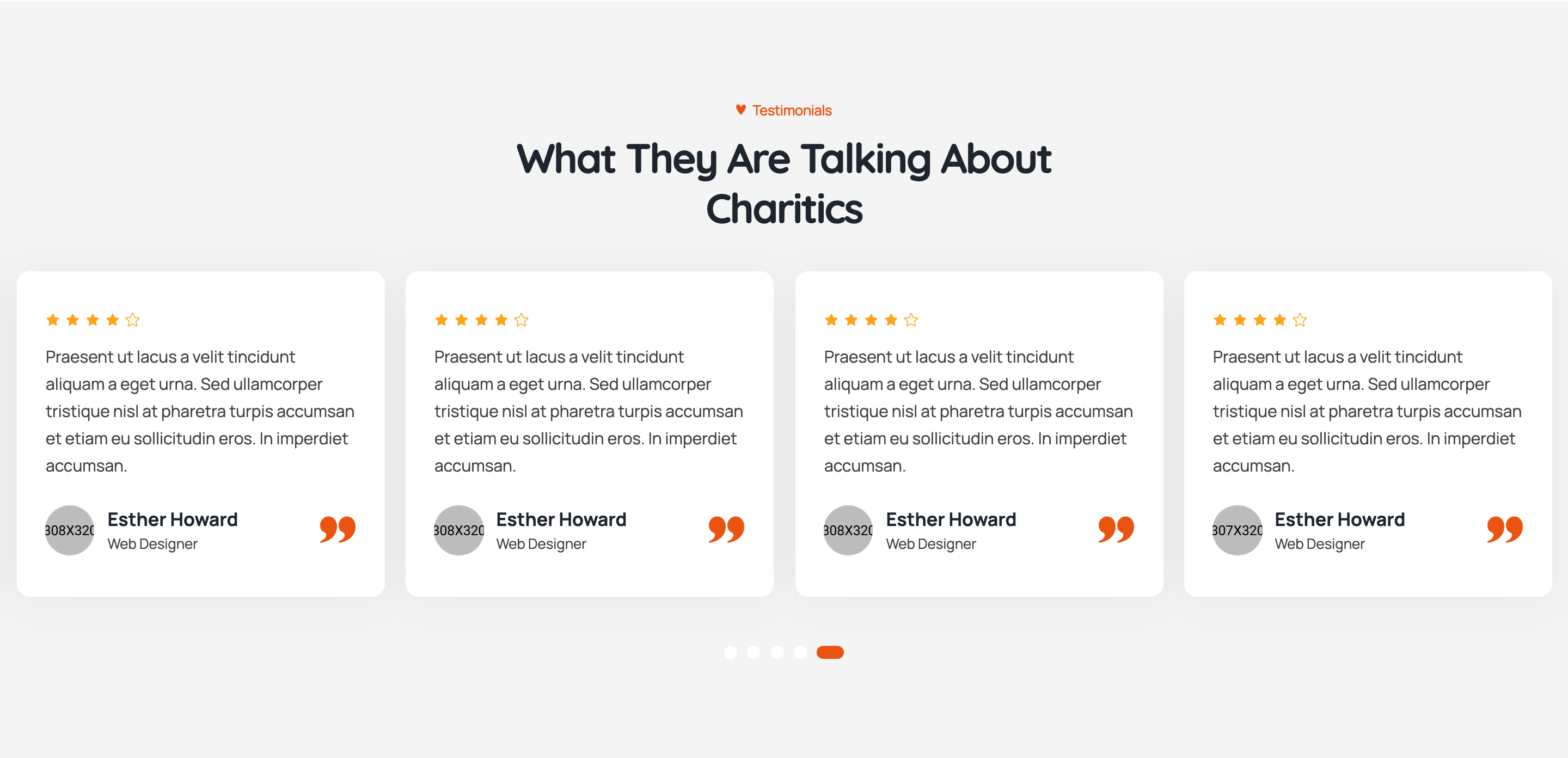
Centred testimonials carousel with five-star rating row, italic-leaning quote, reviewer avatar/name/role at the bottom-left, and a quote-mark glyph at the bottom-right. Pagination is a thin progress bar across the section's bottom edge.
HTML structure (minimal)
<section class="ul-testimonial ul-section-spacing">
  <div class="ul-testimonial-container">
    <div class="ul-section-heading text-center">
      <div>
        <span class="ul-section-sub-title">Testimonials</span>
        <h2 class="ul-section-title">What They Are Talking About Charitics</h2>
      </div>
    </div>

    <div class="ul-testimonial-slider swiper">
      <div class="swiper-wrapper">
        <div class="swiper-slide">
          <div class="ul-review">
            <div class="ul-review-rating">
              <i class="flaticon-star"></i><i class="flaticon-star"></i><i class="flaticon-star"></i>
              <i class="flaticon-star"></i><i class="flaticon-star-1"></i>
            </div>
            <p class="ul-review-descr">Praesent ut lacus a velit tincidunt aliquam...</p>
            <div class="ul-review-bottom">
              <div class="ul-review-reviewer">
                <div class="reviewer-image"><img src="member-1.jpg" alt=""></div>
                <div>
                  <h3 class="reviewer-name">Esther Howard</h3>
                  <span class="reviewer-role">Web Designer</span>
                </div>
              </div>
              <div class="ul-review-icon"><i class="flaticon-left"></i></div>
            </div>
          </div>
        </div>
        <!-- more slides -->
      </div>
      <div class="ul-testimonial-slider-pagination"></div>
    </div>
  </div>
</section>
Key SCSS tokens
.ul-review {
  background: var(--ul-c4);
  padding: clamp(24px, 2.10vw, 40px);
  border-radius: clamp(8px, 1.05vw, 20px);
  position: relative;
}
.ul-review-rating i {
  color: var(--ul-secondary);   /* amber stars */
  font-size: 16px;
}
.ul-review-rating .flaticon-star-1 {
  color: var(--ul-c3);          /* dimmer empty star */
}
.ul-review-descr {
  font-size: clamp(15px, 1.05vw, 18px);
  font-weight: 500;
  color: var(--ul-p);
  margin: 16px 0 24px;
}
.ul-review-bottom {
  display: flex; align-items: center; justify-content: space-between;
}
.ul-review-icon i {
  font-size: clamp(40px, 3.15vw, 60px);
  background: var(--ul-gradient);
  -webkit-background-clip: text;
  background-clip: text;
  -webkit-text-fill-color: transparent;
  opacity: .5;
}
.swiper-pagination-progressbar {
  height: 3px;
  background: var(--ul-c3);
  .swiper-pagination-progressbar-fill {
    background: var(--ul-gradient);
  }
}
Animation logic
new Swiper(".ul-testimonial-slider", {
  slidesPerView: 1, loop: true, autoplay: true, spaceBetween: 15,
  pagination: { el: ".ul-testimonial-slider-pagination", type: "progressbar" },
  breakpoints: {
    576: { slidesPerView: 2 },
    992: { slidesPerView: 3, spaceBetween: 20 },
    1680: { slidesPerView: 3, spaceBetween: 26 },
    1700: { slidesPerView: 3, spaceBetween: 30 }
  }
});
Notable details
- Five stars use two icon variants: filled
flaticon-starfor the lit ones andflaticon-star-1for the dim trailing one — easy to vary 4.5 vs 5.0 ratings by mixing the two. - The decorative quote glyph at bottom-right is faded to 50% opacity and uses the same
background-clip: textgradient trick as the stats icons. - Pagination is a
progressbartype Swiper pagination, not bullets — fits the minimal aesthetic. - Cream review surface (
--ul-c4) makes the dark review text readable while still visually warm.
Use when
- Charity testimonials, donor reviews, course graduate quotes.
- Any place where a 3-up testimonial slider is preferred over a single big quote.
- When you want a Swiper progress bar rather than visible pagination dots.
Caveats
- Loop + autoplay restart cycles can interfere with focus management — consider disabling autoplay if accessibility is a priority.
- The icon-font star treatment makes it impossible to do half-stars without an extra icon — swap to SVG if half-rating display is needed.